Winners of the 2016 Steel Competition
The American Institute of Steel Construction (AISC) and the Association of Collegiate Schools of Architecture (ACSA) have selected the recipients of the 2016 Steel Design Student Competition. The competition recognizes eleven exceptional projects, in two categories, that explore a variety of design issues related to the use of steel in design and construction.
The 2016 jury for the Steel Design Student Competition includes:
Antony Wood, Council on Tall Buildings & Urban Habitat
Jon Magnusson, Magnusson Klemencic
Gail Borthwick, Gensler
Doris Sung, University of Southern California
Lee Su Huang, University of Florida
Elizabeth O’Donnell, The Cooper Union
Listed below are the names of the recipients, their school, the faculty sponsor, and project title.
Category I: TALL BUILDINGS
1st Place – VertiCali
Student: Mario Ramos, Texas Tech University
Faculty Sponsor: Peter Stapleton Raab, Texas Tech University



Project Description
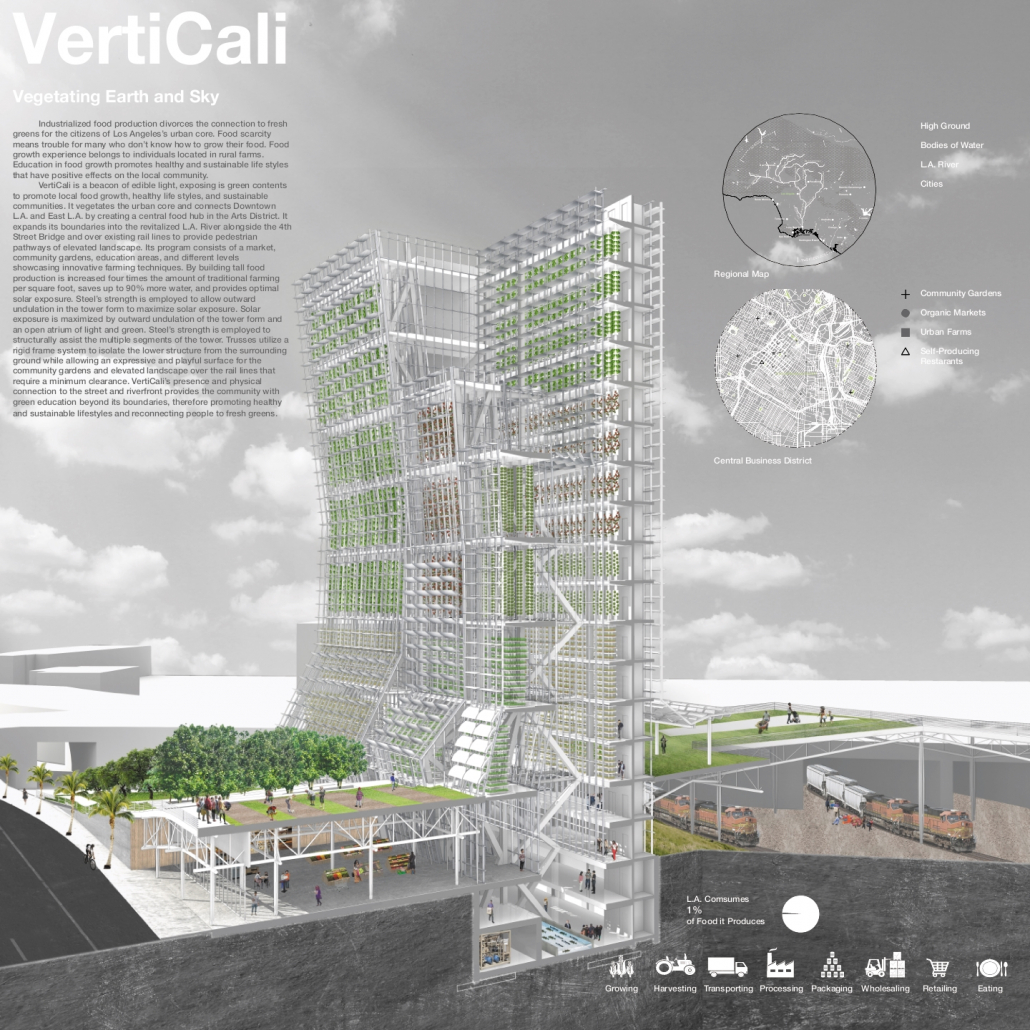
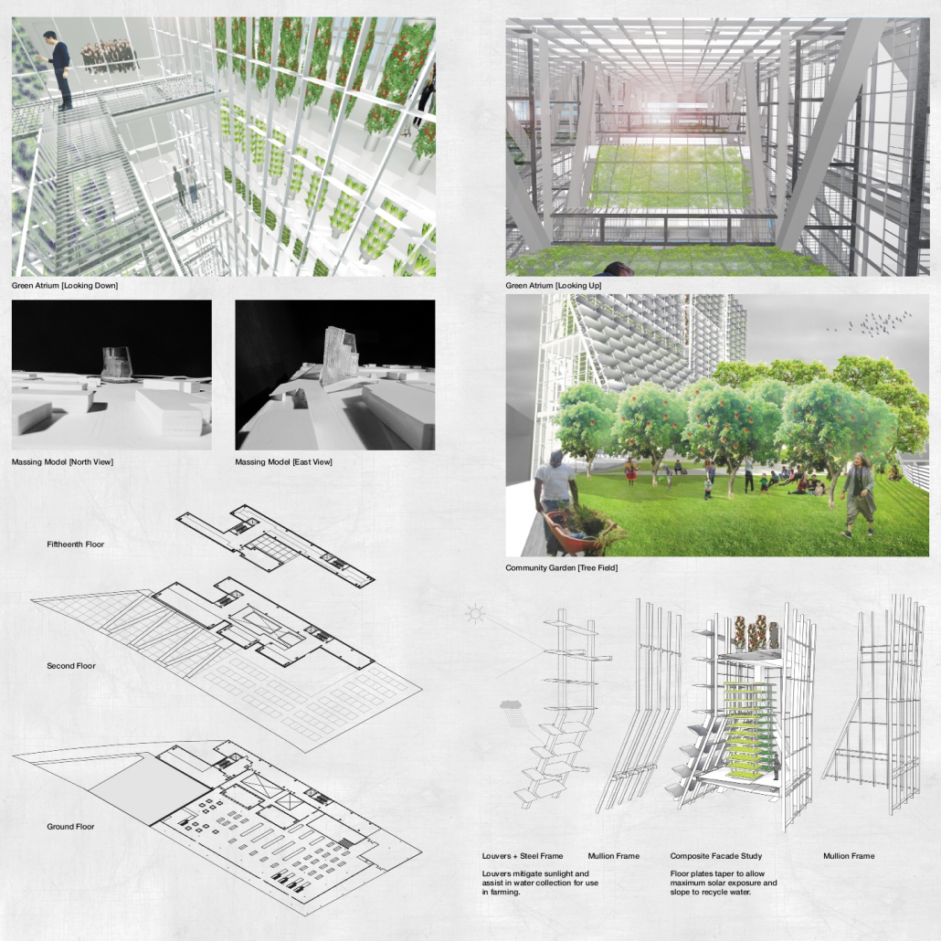
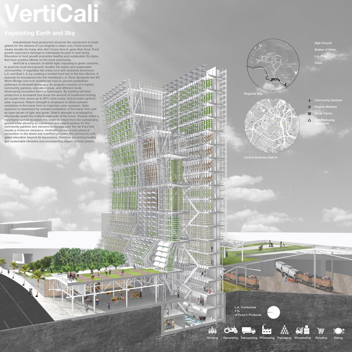
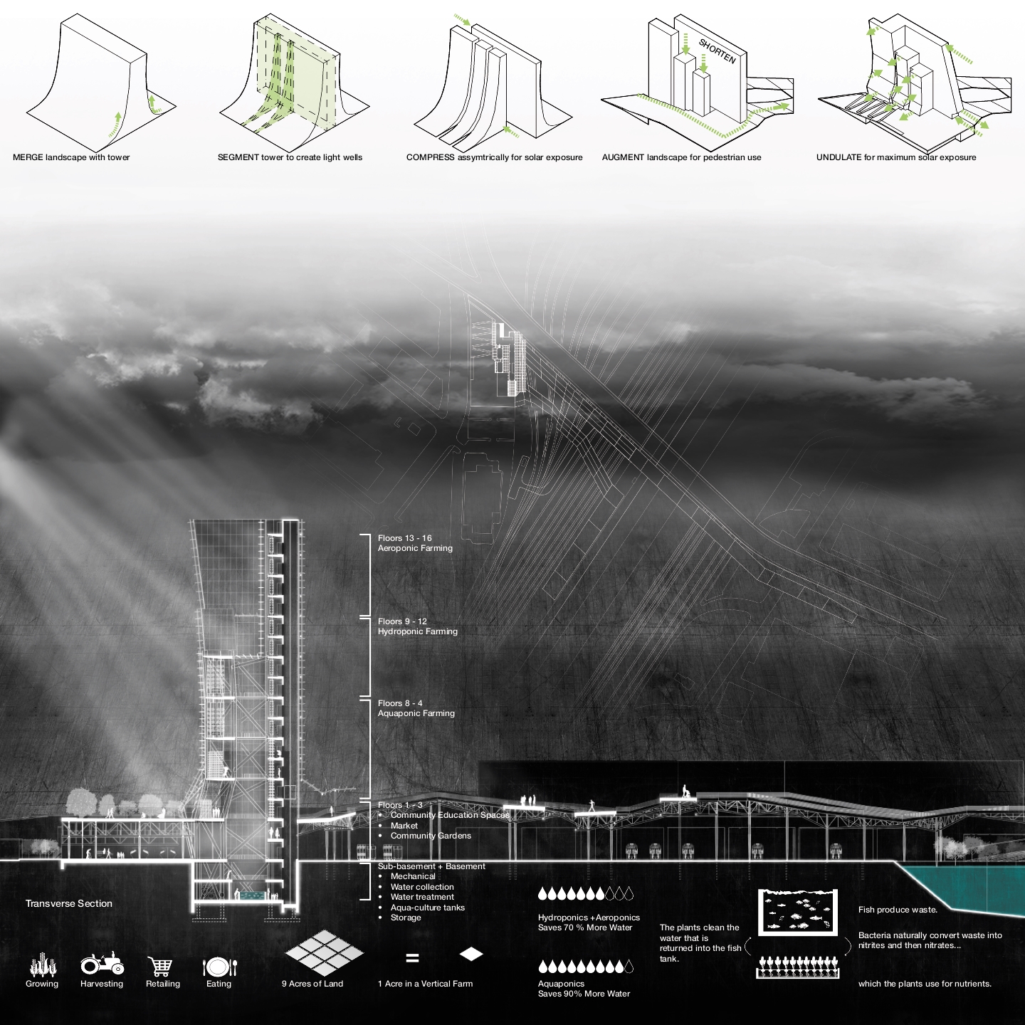
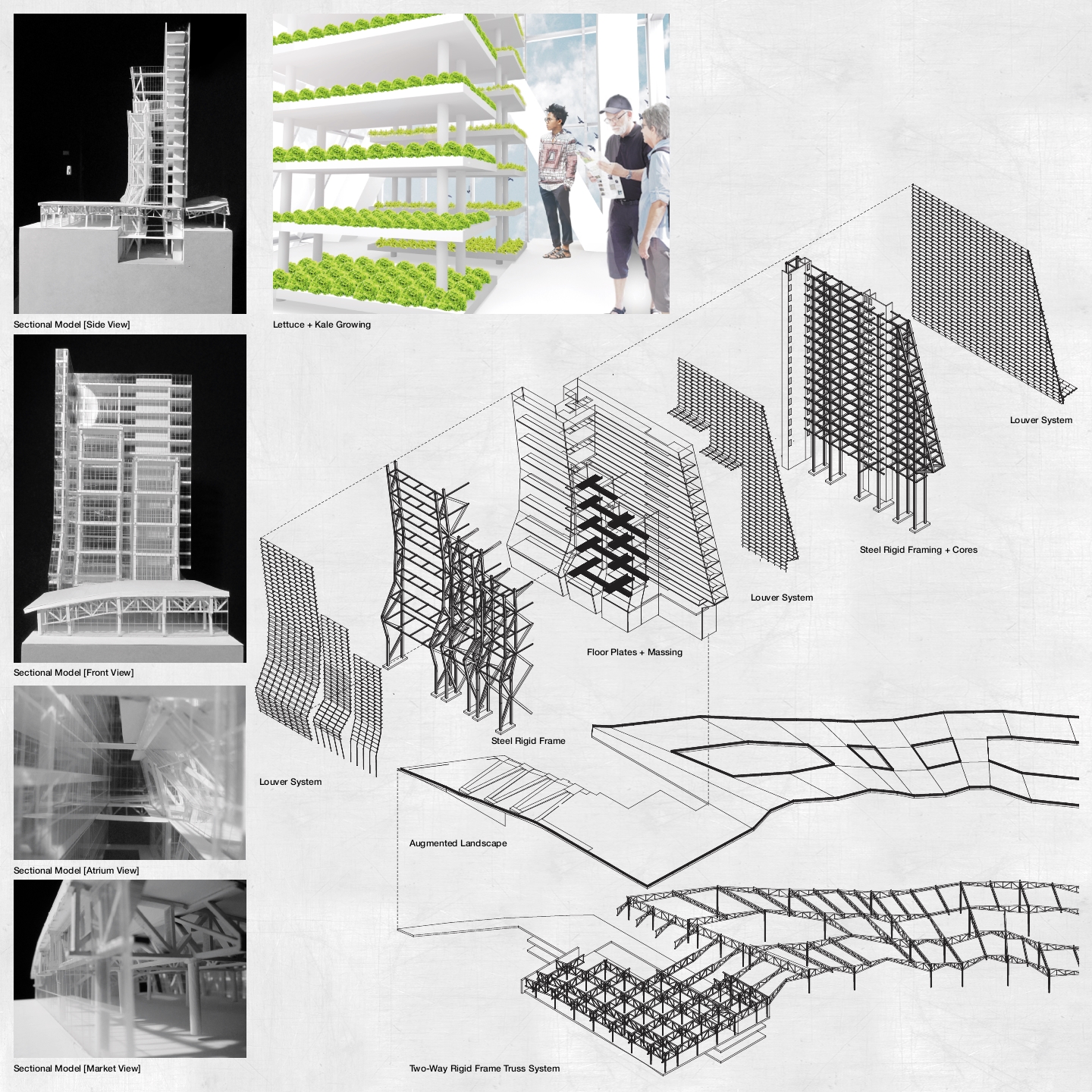
Industrialized food production divorces the connection to fresh greens for the citizens of Los Angeles’s urban core. Food scarcity means trouble for many who don’t know how to grow their food. Food growth experience belongs to individuals located in rural farms. Education in food growth promotes healthy and sustainable life styles that have positive effects on the local community. VertiCali is a beacon of edible light, exposing is green contents to promote local food growth, healthy life styles, and sustainable communities. It vegetates the urban core and connects Downtown L.A. and East L.A. by creating a central food hub in the Arts District. It expands its boundaries into the revitalized L.A. River alongside the 4th Street Bridge and over existing rail lines to provide pedestrian pathways of elevated landscape. Its program consists of a market, community gardens, education areas, and different levels showcasing innovative farming techniques. By building tall food production is increased four times the amount of traditional farming per square foot, saves up to 90% more water, and provides optimal solar exposure. Steel’s strength is employed to allow outward undulation in the tower form to maximize solar exposure. Solar exposure is maximized by outward undulation of the tower form and an open atrium of light and green. Steel’s strength is employed to structurally assist the multiple segments of the tower. Trusses utilize a rigid frame system to isolate the lower structure from the surrounding ground while allowing an expressive and playful surface for the community gardens and elevated landscape over the rail lines that require a minimum clearance. VertiCali’s presence and physical connection to the street and riverfront provides the community with green education beyond its boundaries, therefore promoting healthy and sustainable lifestyles and reconnecting people to fresh greens.
Category II: OPEN
1st Place – Juncture
Students: John Berger & Sasha Francoeur, Boston Architectural College
Faculty Sponsor: Robert Gillig, Boston Architectural College



Project Description
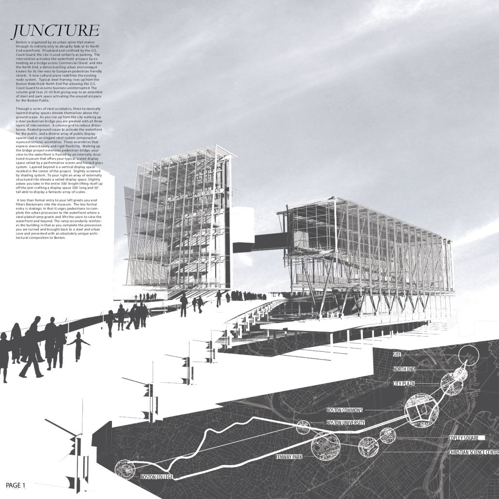
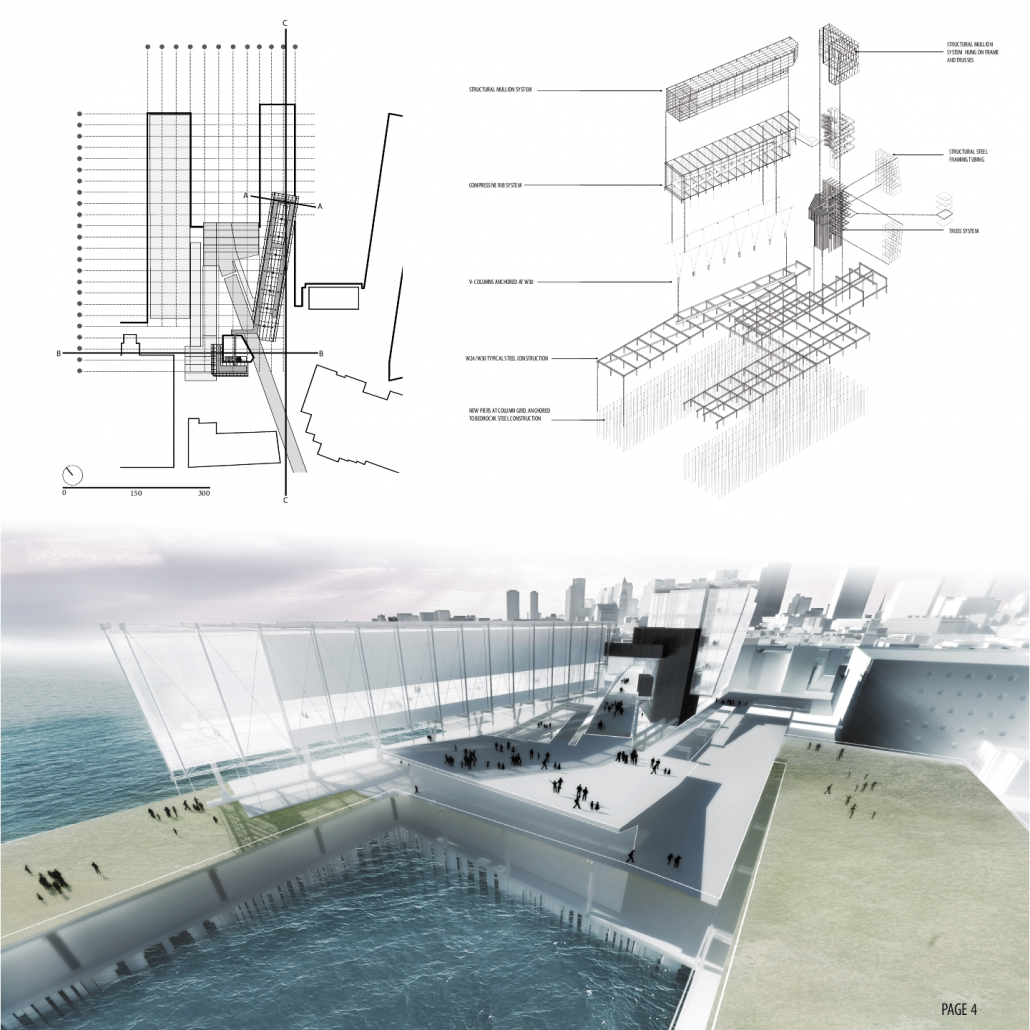
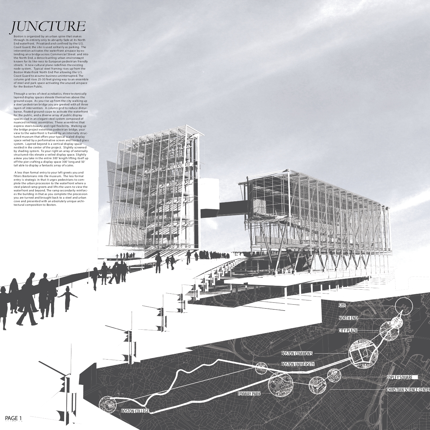
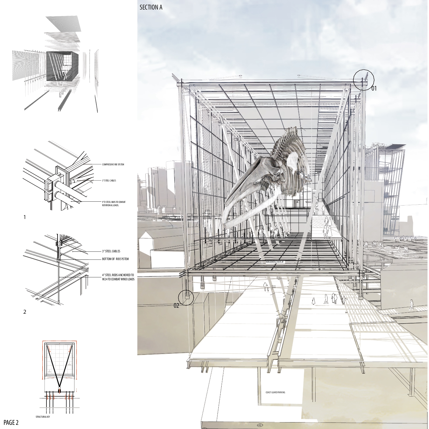
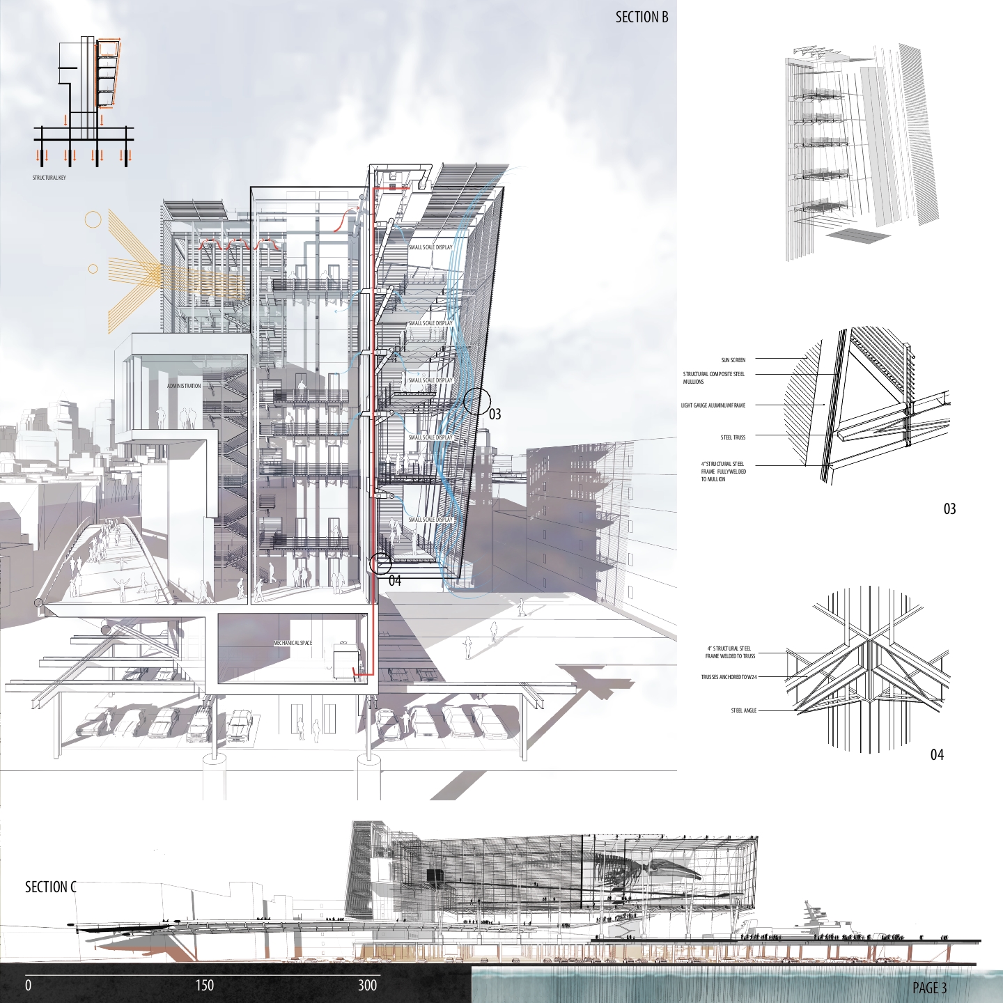
Boston is organized by an urban spine that snakes through its entirety only to abruptly fade at its North End waterfront. Privatized and confined by the U.S. Coast Guard, the site is used solely as a parking lot. The intervention activates the waterfront airspace by extending a bridge across Commercial Street and into the North End, a dense bustling urban environment known for its likeness to European pedestrian friendly streets. A new cultural plane redefines the existing node system bringing urban life to the waterfront. Typical steel framing rises up from the Boston Waterfront North End Pier allowing the U.S. Coast Guard to assume business uninterrupted. The column grid rises 25-30 feet giving way to an ensemble of steel and park space activating the unused space for the Boston Public. Through a series of steel acrobatics, three tectonically layered display spaces elevate themselves above the groundscape. As you rise up from the city, walking up a steel pedestrian bridge, you are greeted with three layers of intervention. A column grid to reduce disturbance, a floated groundscape to activate the waterfront for the public and a diverse array of public display spaces clad in elegant steel systems composed of nuanced tectonic assemblies. These assemblies express steels beauty rigidity and flexibility.
Category I: TALL BUILDINGS
2nd Place – Diagroup Tower
Students: Scott Proudfoot, Mengdie Zhang, Sarah Donaldson, & Gabriela Chorobik, University of Waterloo
Faculty Sponsor: Terri Meyer Boake, University of Waterloo




Project Description
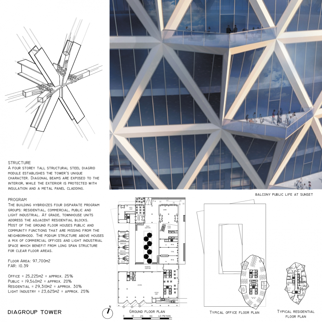
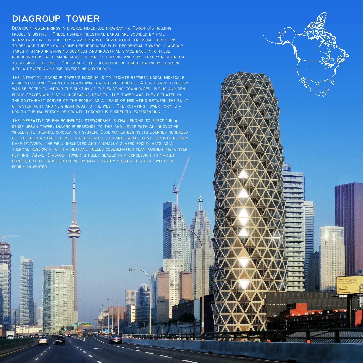
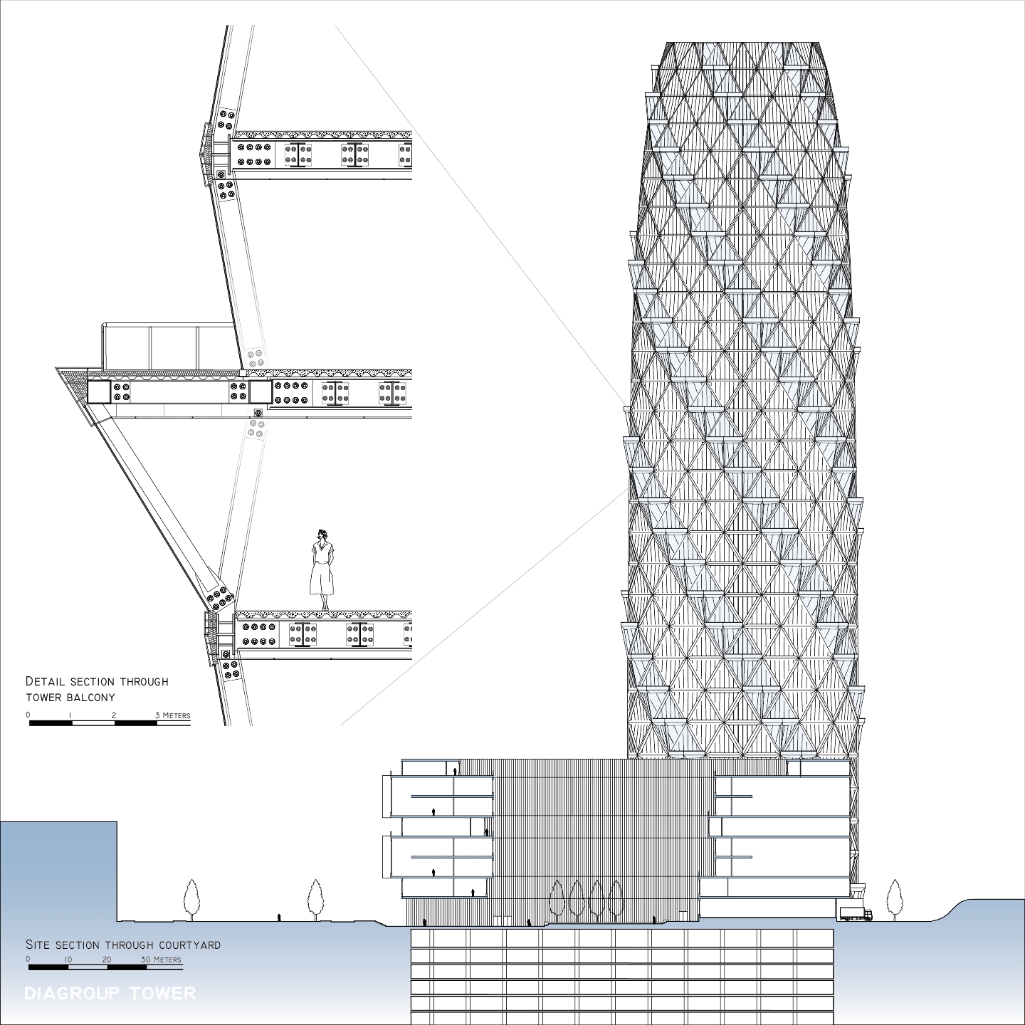
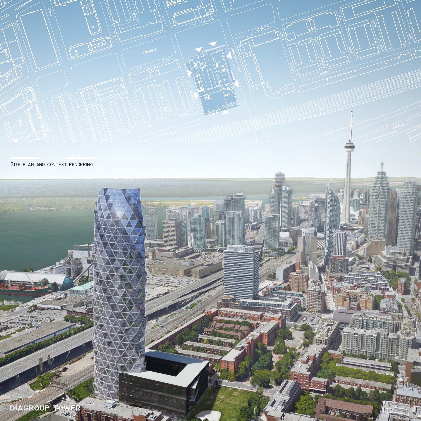
Diagroup Tower brings a diverse mixed-use program to Toronto’s housing projects district. These former industrial lands are bounded by rail infrastructure on the city’s waterfront. Development pressure threatens to replace these low income neighborhoods with residential towers. Diagroup takes a stand in bringing business and industrial space back into these neighborhoods, with an increase in rental housing and some luxury residential to subsidize the rest. The goal is the upgrading of tired low income housing into a denser and more diverse neighborhood. The intention Diagroup Tower’s massing is to mediate between local mid-scale residential and Toronto’s downtown tower developments. A courtyard typology was selected to mirror the rhythm of the existing townhouses’ public and semi-public spaces while still increasing density. The tower was then situated in the south-east corner of the podium as a means of mediating between the built up waterfront and neighborhoods to the west. The rotating tower form is a nod to the maelstrom of growth Toronto is currently experiencing. The imperative of environmental stewardship is challenging to embody in a dense urban tower. Diagroup responds to this challenge with an innovative whole-site thermal circulation system. Cool water begins its journey hundreds of feet below street level in geothermal exchange wells that tap into nearby Lake Ontario. The well insulated and minimally glazed podium acts as a thermal reservoir, with a methane fueled cogeneration plan augmenting winter heating. Above, Diagroup Tower is fully glazed in a concession to market forces, but the whole building hydronic system shares this heat with the podium in winter.
Category II: OPEN
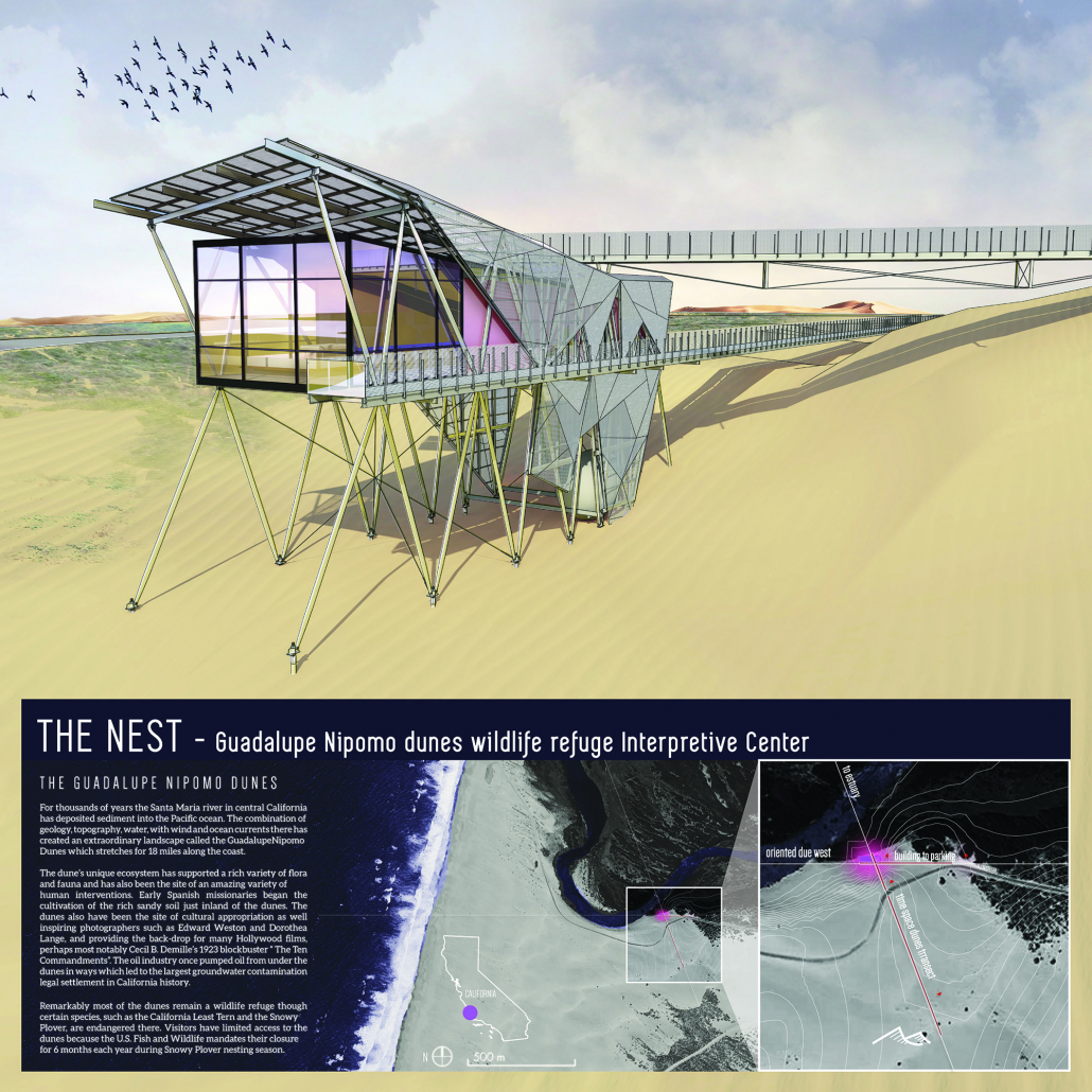
2nd Place – THE NEST
Student: Edern Audrain, California Polytechnic State University
Faculty Sponsor: Jonathan Reich, California Polytechnic State University


Project Description
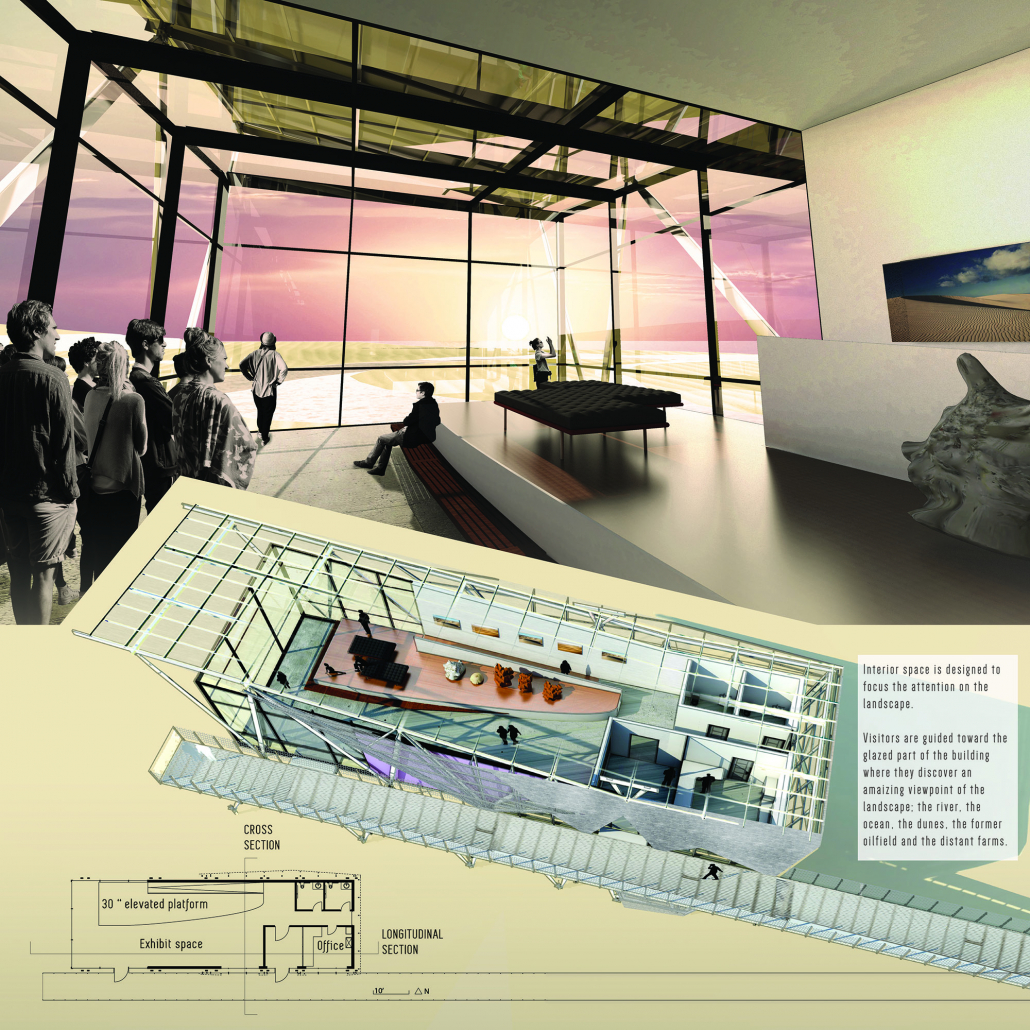
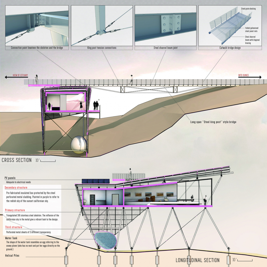
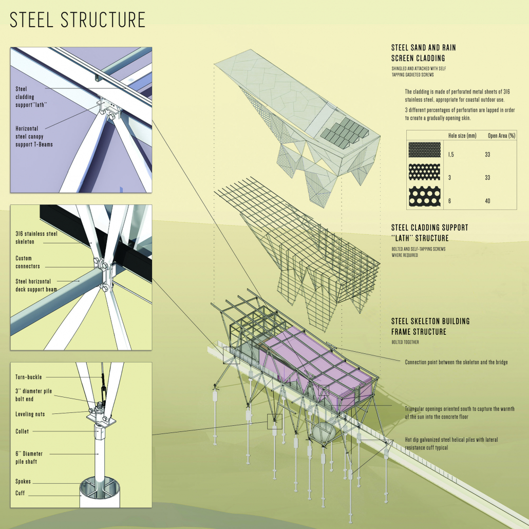
The purpose of the Guadalupe Nipomo Dunes Interpretive Center is to provide basic visitor information and facilities at the entrance to the dunes and also to provide visitors fully accessible but limited access, to experience and thus hopefully value this landscape, by means of a controlled walkway into the dunes which will not interfere with the seasonal sensitivities of the flora and fauna there. The âpassive designedâ building, intended to take advantage of the mild and very constant temperatures there, is equipped with triple glazing and extra insulation and mainly serves to protect users from the wind and wind-driven sand. Steel is proposed as the dominate structural material for its efficient strength to weight ratio and for minimizing the on-site construction impact through use of carefully designed parts which can be installed piece by piece. Steel is also employed as the exterior cladding sun/rain/sand screen and for the many building specialties (railings, fittings, etc.) utilizing 316 stainless steel alloy for its renowned weathering resistance. Different finishes and hues in the steel allow the building to have different visual appearances in the landscape depending on the light, at times glittering object in the sand and at times reflective of the subtle colors in the sky at dawn or sunset. This design for the building to be perched on the edge of the bluff over the river allows the visitors an extraordinary viewpoint from which to survey much of the landscape; the river, the ocean, the dunes, the former oilfield, the distant farms, and allows close interaction with the dune-scape itself via the two accessible walkways – one leading visitors from the parking lot to the building and the other leading visitors deep into the dunes.
Category I: TALL BUILDINGS
3rd Place – Tessellate
Student: Megan Stenftenagel, Ball State University
Faculty Sponsor: Robert J. Koester, Ball State University



Project Description
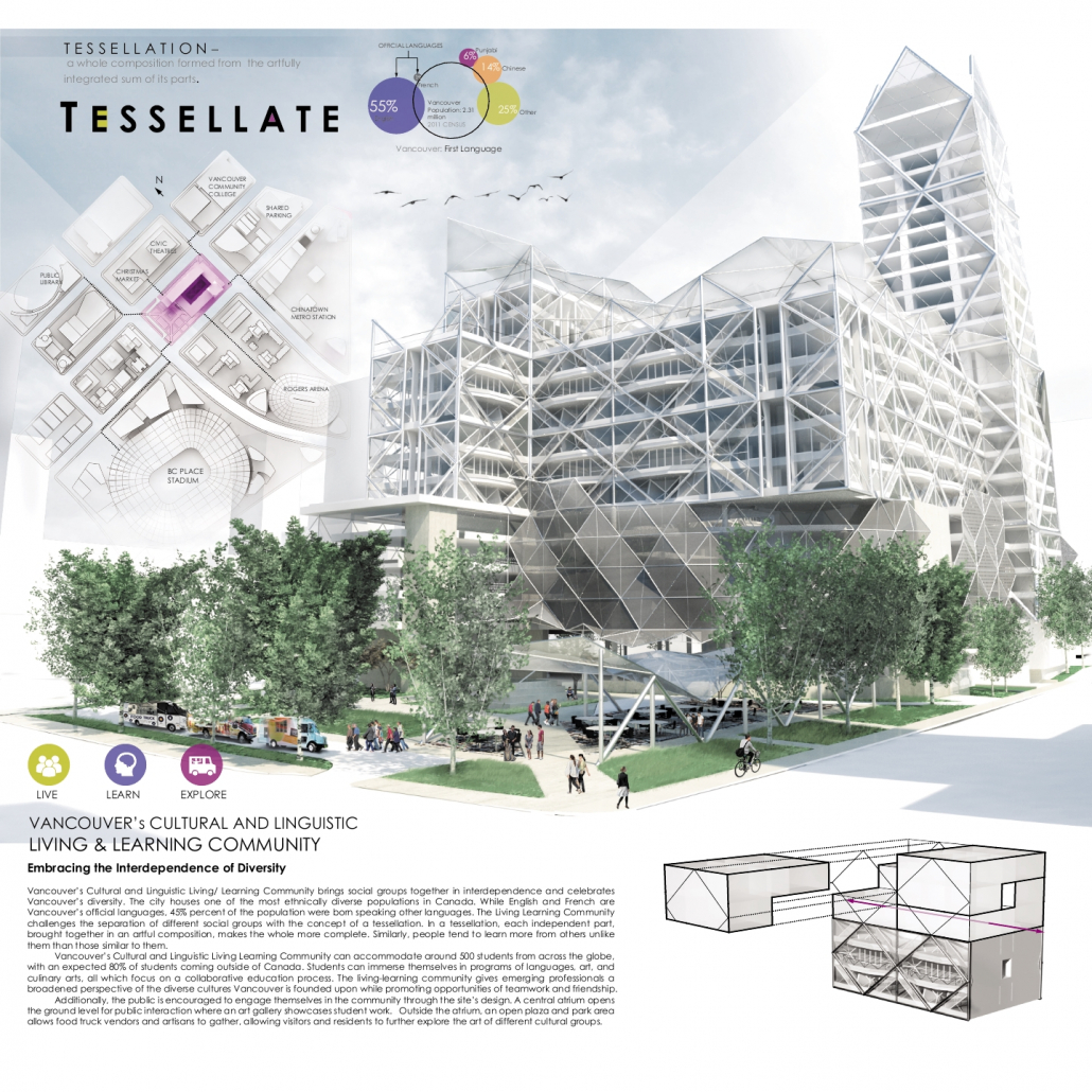
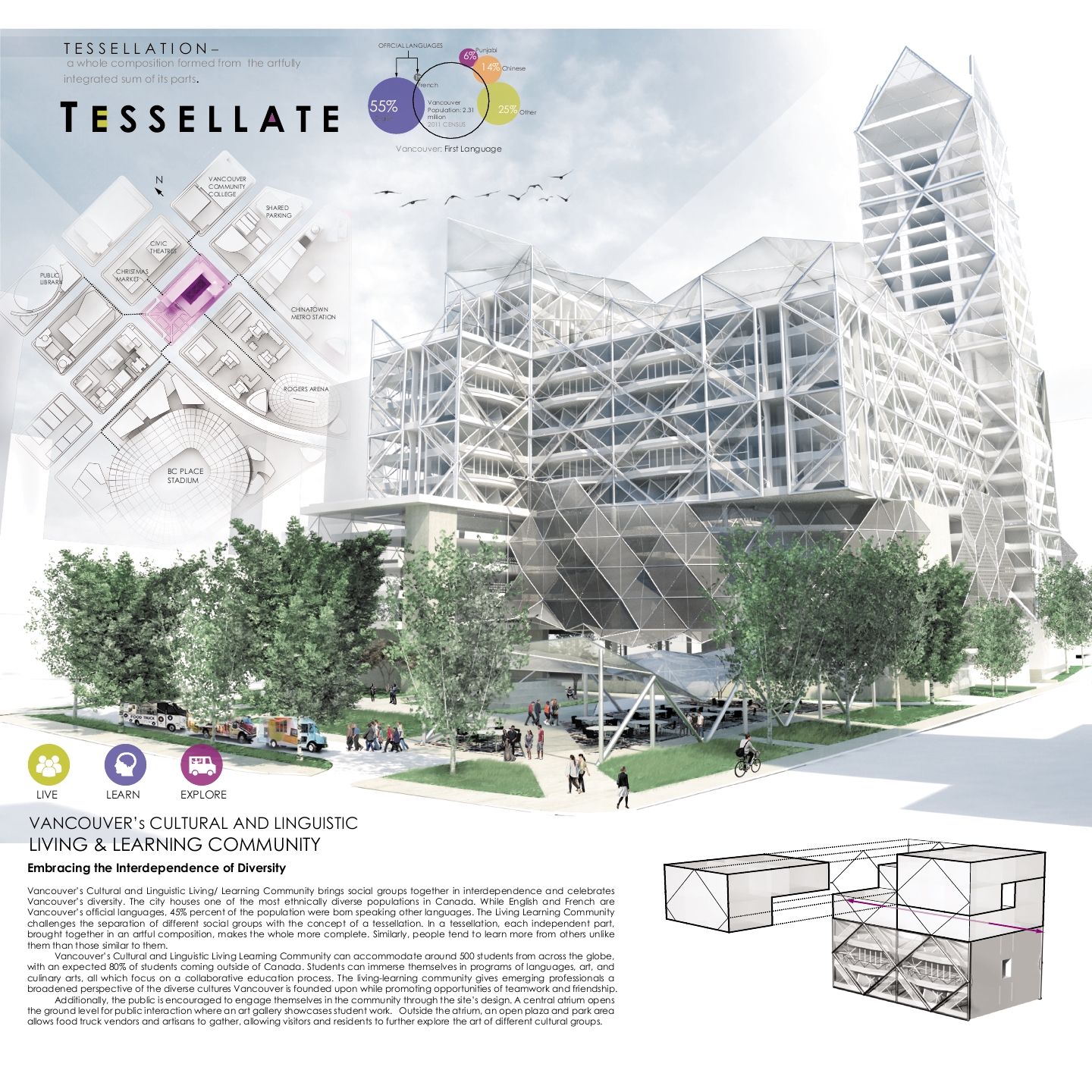
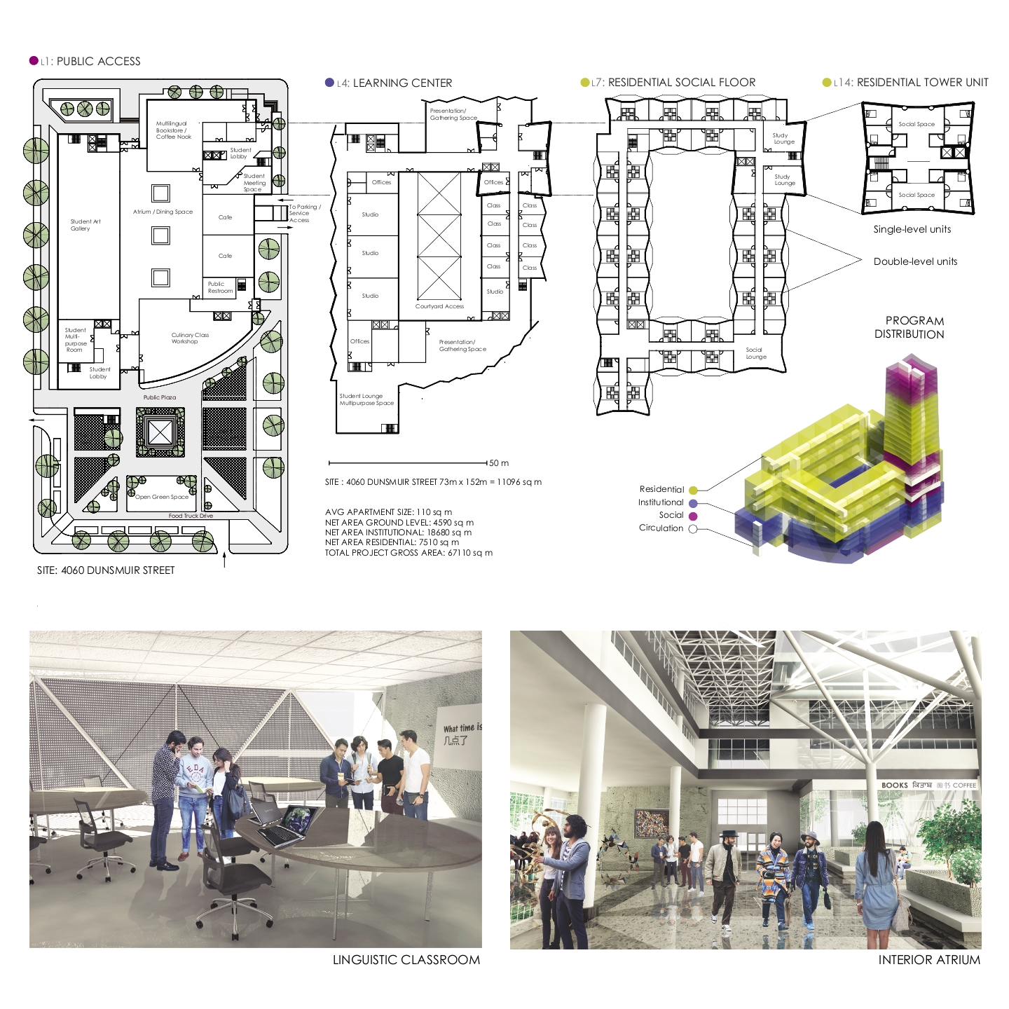
Vancouver’s Cultural and Linguistic Living-Learning Community brings social groups together in interdependence to celebrate Vancouver’s diversity. The city houses one of the most ethnically diverse populations in Canada. While English and French are Vancouver’s official languages, 45% percent of the population were born speaking other languages. The living-learning community challenges the separation of different social groups with the concept of a tessellation. In a tessellation, each independent part, brought together in an artful composition, makes the whole more complete. Similarly, people tend to learn more from others unlike them than those similar to them.
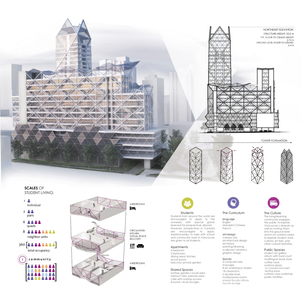
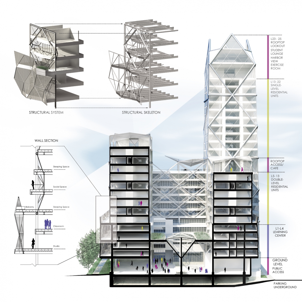
Vancouver’s Cultural and Linguistic Living-Learning Community can accommodate approximately 500 students from across the globe, with an expected 80% of students coming outside of Canada. Students can immerse themselves in programs of languages, art, and culinary arts, all which focus on a collaborative education process. The living-learning community gives emerging professionals a broadened perspective of the diverse cultures Vancouver is founded upon while promoting opportunities for teamwork and friendship.
Additionally, the public is encouraged to engage in the community personally through the site’s design. A central atrium opens the ground level for public interaction with an art gallery to showcase student work. Outside the atrium, an open plaza, covered seating, and park area enable food truck vendors and artisans to gather, promoting visitors and residents to further explore the art of different cultural groups.
Category II: OPEN
3rd Place – Productive | Accessible | Ecofriendly
Student: Jesus J. Alfonso Pagan, Pontifical Universidad Catolica de Puerto Rico
Faculty Sponsors: Luis Ayala-Rubio, Alberto Jordán, Jesús García Beauchamp, Carlos Quiñones-Maymí, & Luis Conty, Pontifical Universidad Catolica de Puerto Rico



Project Description
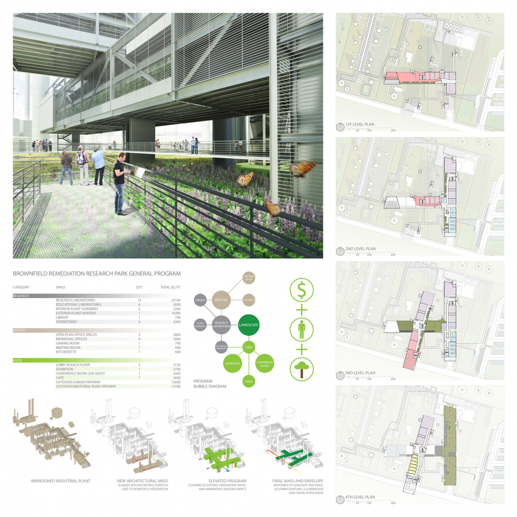
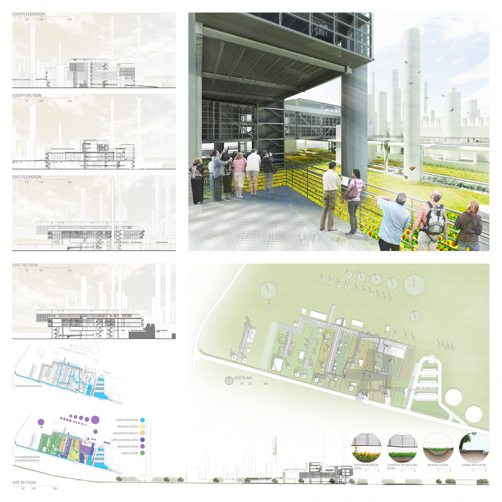
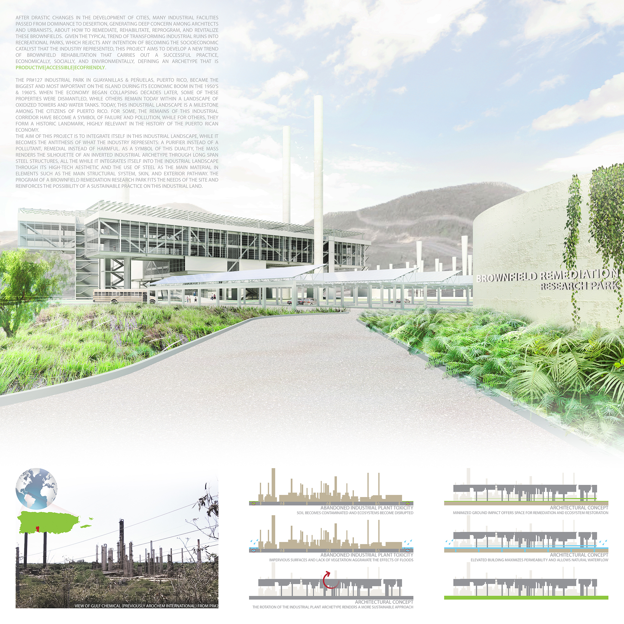
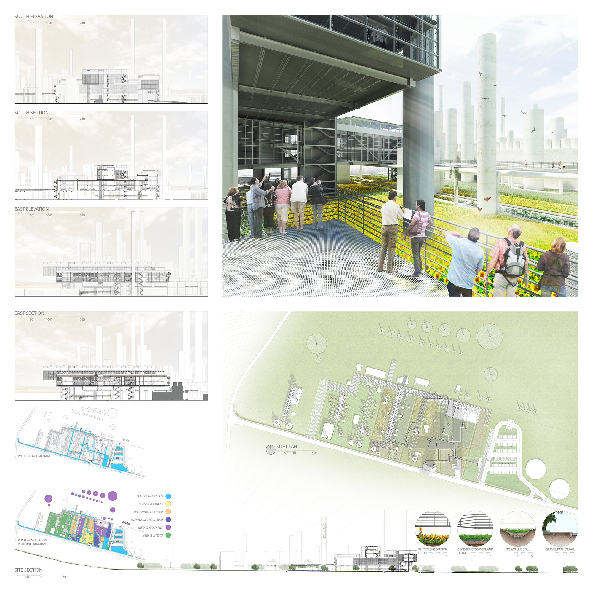
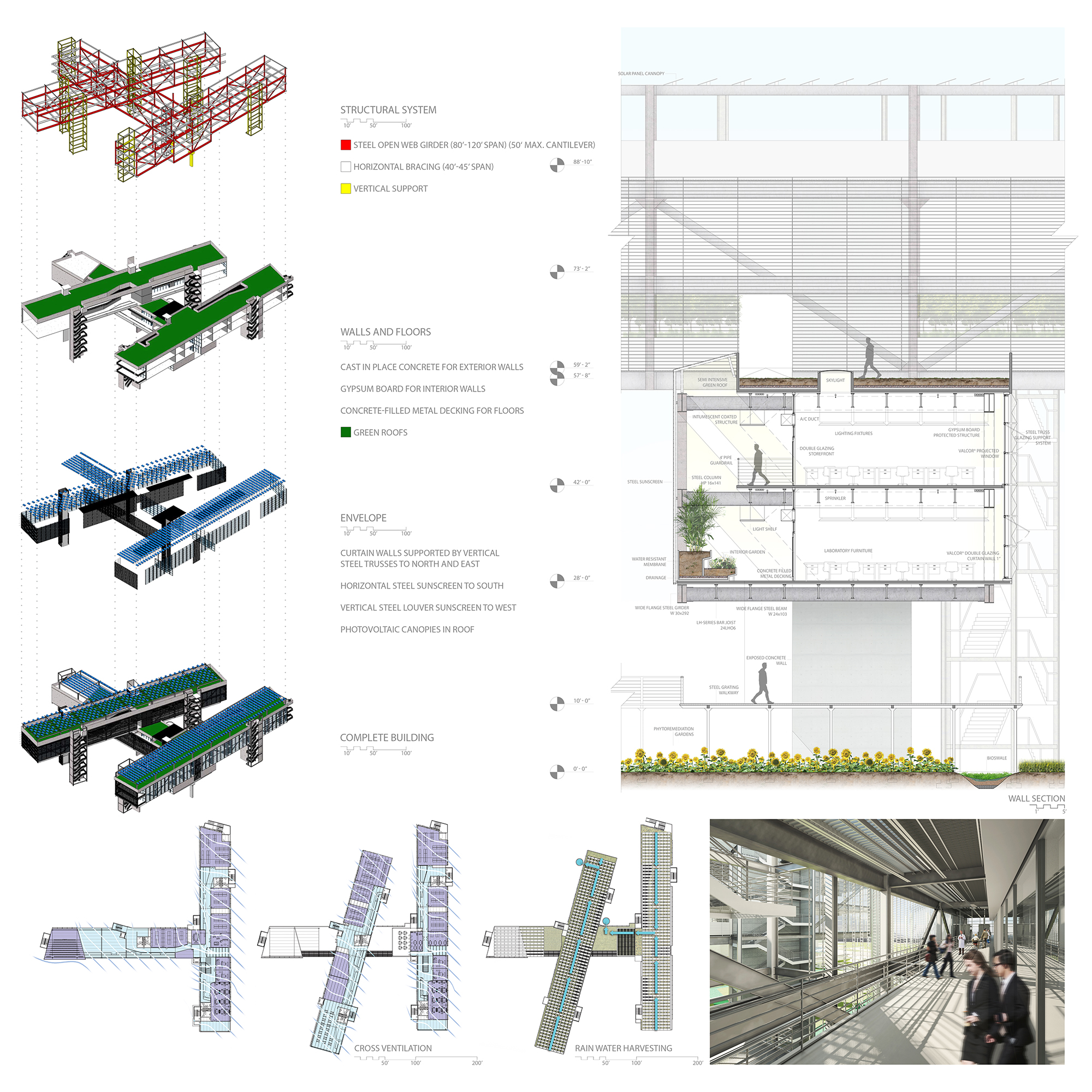
This project explores the brownfield rehabilitation of an abandoned petrochemical complex located in Guayanilla & Peñuelas, Puerto Rico, with the aim of integrating itself into this steel landscape of oxidized towers and water tanks while becoming the antithesis of what the industry represented: a purifier instead of a pollutant; remedial instead of harmful. The building outline renders the silhouette of an industrial archetype turned upside-down, where tall chimneys and disruptive, long corridors become long-span steel structures that cantilever over the landscape, maximizing views and minimizing ground impact, allowing the ecosystem to be restored. Integrating active and passive sustainable building systems and landscape remediation strategies, this Brownfield Remediation Research Park honors the past while offering a more productive, accessible, and ecofriendly approach for the future.
Category I: TALL BUILDINGS
HM – Voided Tower
Students: Janusz Ziobrowski, Karolina Rachwal, & Yiwen Wu, University of Tennessee-Knoxville
Faculty Sponsor: Kevin Stevens, University of Tennessee-Knoxville



Project Description
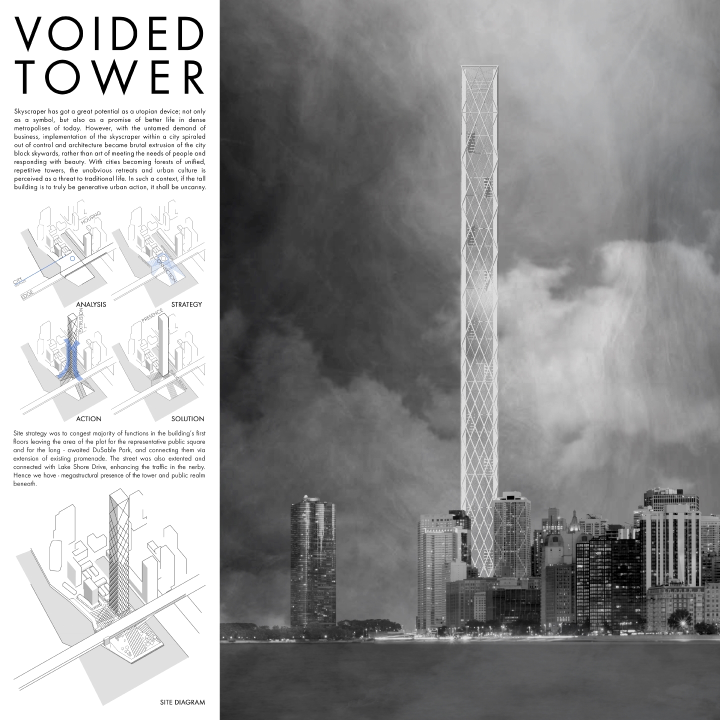
Skyscraper has a great potential as the utopian device. However, with the undeniable demand of business, implementation of the skyscraper within a city spiraled out of control and the form became a simple, brutal extrusion. With cities becoming forests of repetitive towers, living habitat is disconnected from the ground and urban life, being perceived as a threat to traditional life.
On the other hand skyscraper is against almost everything that is praised in time–honored architecture – against natural, human tendencies of perception. It is enigmatic, sheltering its structural logic behind the envelope. It is out of scale, overwhelming the individual with its megastructure, disconnected from the street and its life. However, it is also pure potentiality, multiplying the floors, forming a refuge or a dwelling as a city within a city, sheltering one from the urban life it creates; a metaphor and a statement. The skyscraper is radical, inconceivable, disconnected from urban reality and otherworldly.
The skyscraper is ambivalent – ominous and out of scale to such an extent, that detailing and overall quality of the design do not matter. Nevertheless, it forms a new typology of a place and renders different presence in the city. This concept is just that – generative action and a statement for Chicago. In such conditions, if the tall building is to truly be a generative urban action, it shall be uncanny. We asked ourselves what did Chicagoans want – they wanted a statement – tall building for the sake of being tall alone. The Chicago Spire project failed yet the dreams remained.
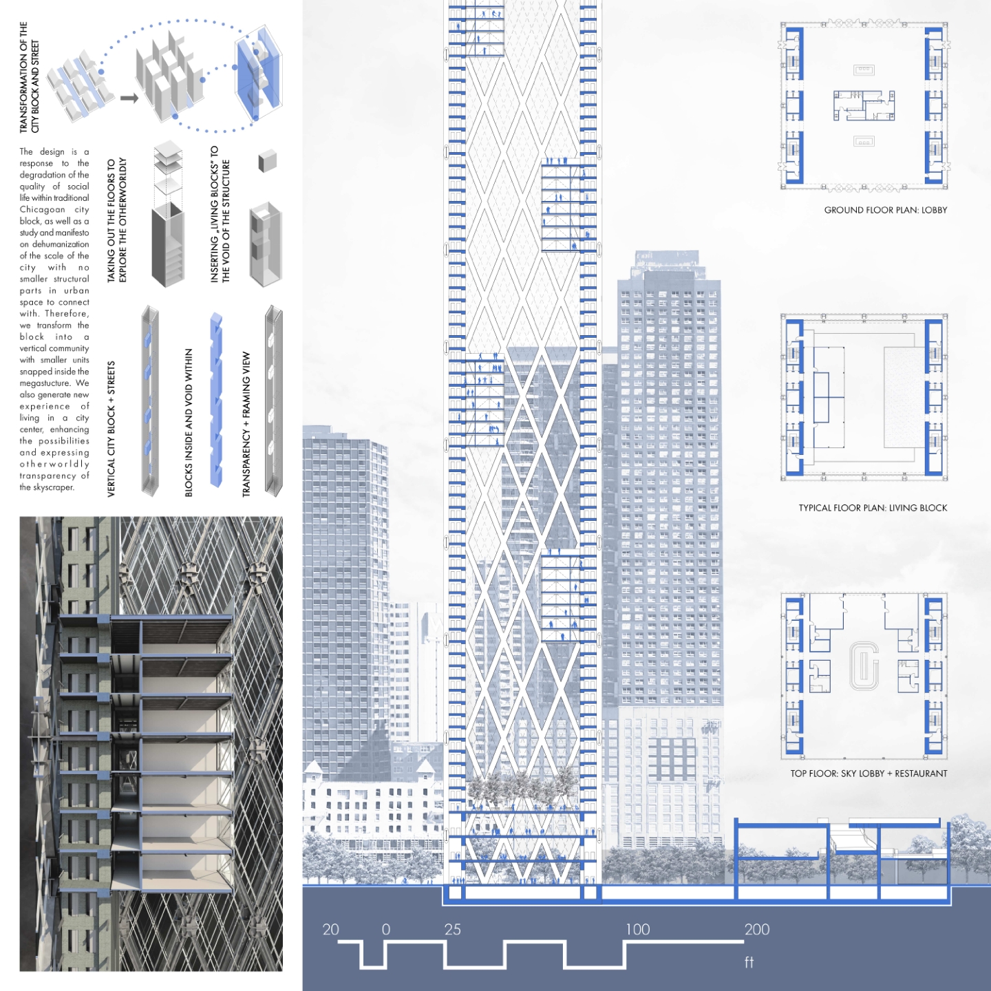
The design is a strong response to the degradation of the quality of social life throughout the years due to the commutation of previous habitat-Chicagoan block into a skyscraper. Therefore, we transform the block into a vertical community with smaller units snapped inside the megastucture. We also generate new experiences of living in a city center, enhancing the possibilities, emphasizing the space inside the tower and expressing otherworldly transparency of the skyscraper. Through the project we wanted to raise a discussion: why do we actually build skyscrapers? Is the original premise of building skyscrapers due to the lack of the plot space still valid? Is their structural logic although rational the most peculiar? And most importantly why through living at the height we can experience the space by looking outside the flat but not looking inside the building? Through this and some other questions we were lead to the final design.
Site strategy was a result of congesting majority of the public functions in the building’s first floors. Program of the tower itself includes exhibition areas, restaurant, cafés, and viewing decks with primary functions of living and co-working. The area of the plot is left for the representative public square and for the long – awaited DuSable Park . The aim was also to connect two parts of the site via extension of the existing promenade. Moreover the street was extended and connected with the Lake Shore Drive to enhance the traffic nearby. Hence we have megastructural presence of the tower and public realm beneath.
Throughout the years skyscrapers shaped their own typology not only in terms of structural systems where concrete cores were wrapped by outer structural elements but also through enclosing the whole system in a rectangular block. During the last few years the tendency was to concentrate on the outer look of the building. Rectangular forms slowly started to become cliché relic of modernism. New skyscrapers looked different from the outside however the structural logic remained the same in the inside. We wanted to inverse this phenomenon– remaining traditional rectangular shape and concentrating on a different organization of the interior. Hence we transform the typology of a skyscraper by removing the essence of it – repetitive floors – leaving the void within. We propose to attach modular boxes to peripheral cores instead, in order to provide living and working space for. At the same time we leave ample space for additional installments if the demand would rise. The intent is to deliver a statement for Chicago, reform traditional Chicagoan skyscraper to a new type of a building , and to create a different experience of living in a tall building.
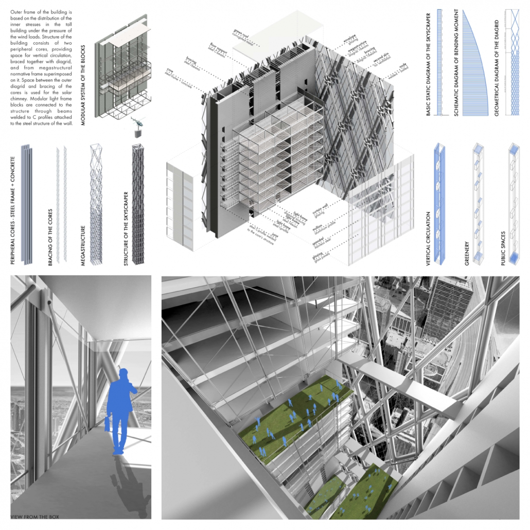
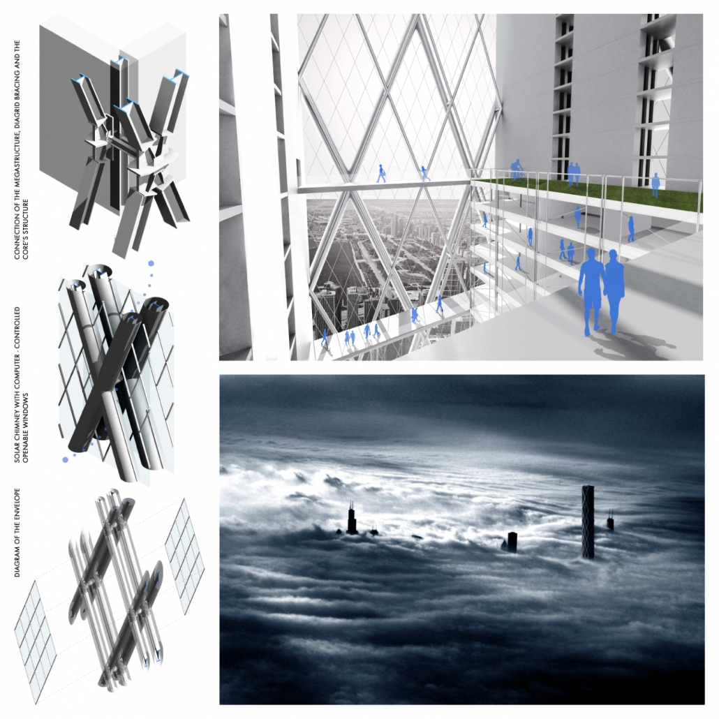
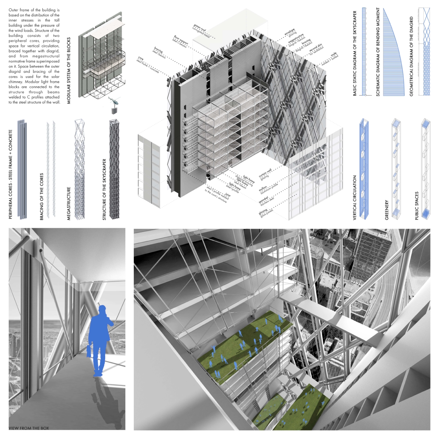
Voided tower structure consists of two peripheral cores, providing space for vertical circulation. It is braced together with a diagrid and by a megastructural normative frame superimposed on it. The space between the outer diagrid and the bracing of the cores is used for the solar chimney. Modular light frame blocks are connected to the structure through beams welded to C profiles attached to the steel structure of the wall. The outer frame of the building is based on the distribution of the inner stresses in the tall building under the pressure of the wind loads. Considering skyscraper as a huge cantilever and analyzing the schematic diagram of bending moment, we can observe the biggest bending moment in the point where the building touches the ground, It indicates that the building will be burdened mostly in the bottom. Hence designing elements of the structure are to counteract the biggest loads. That is why steel diagrid is most dense in the bottom and scarcer in the higher part.
Category II: OPEN
HM – INNOVATION INITIATION
Student: Bridget Geissler, University of Minnesota
Faculty Sponsor: Nat Madson, University of Minnesota


Project Description
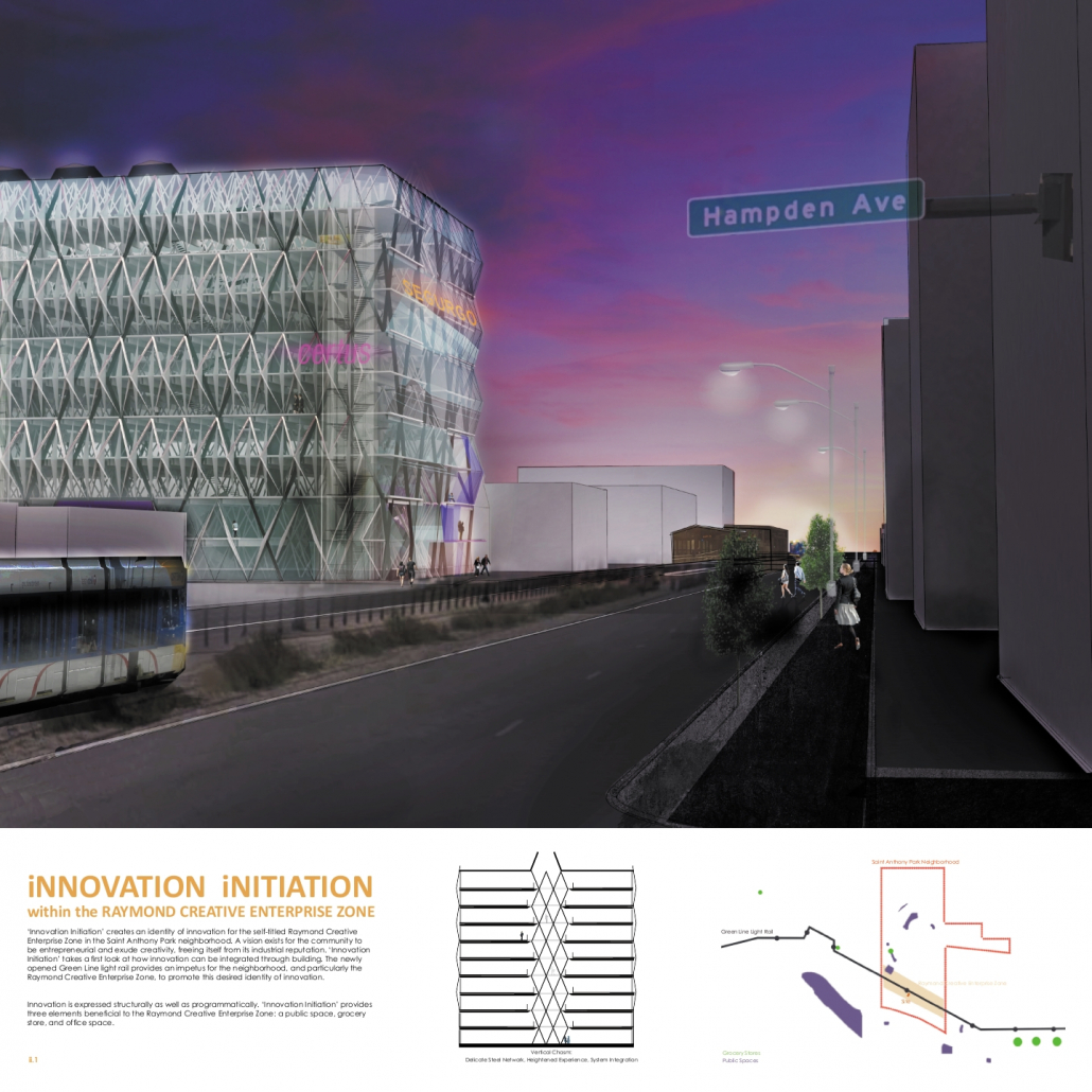
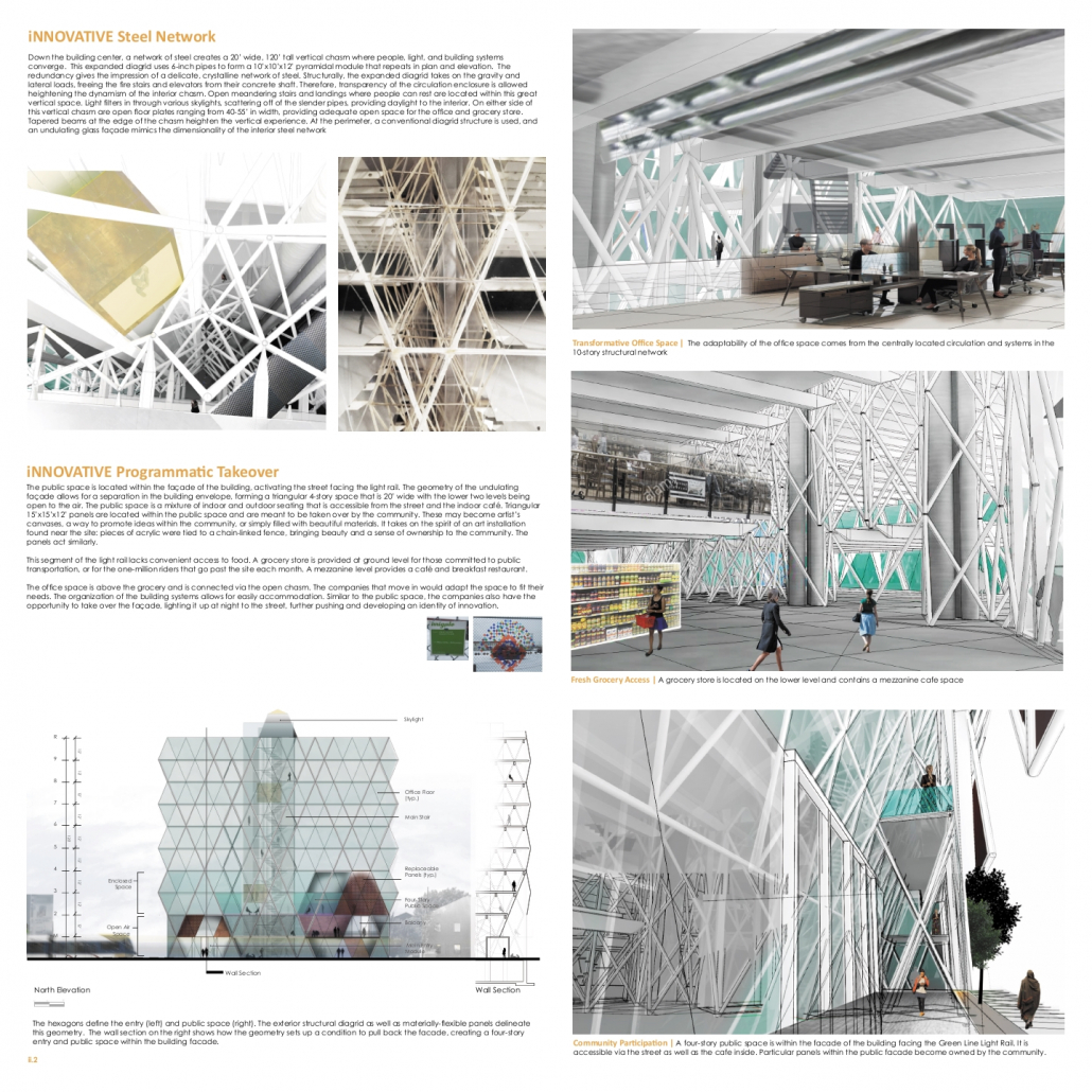
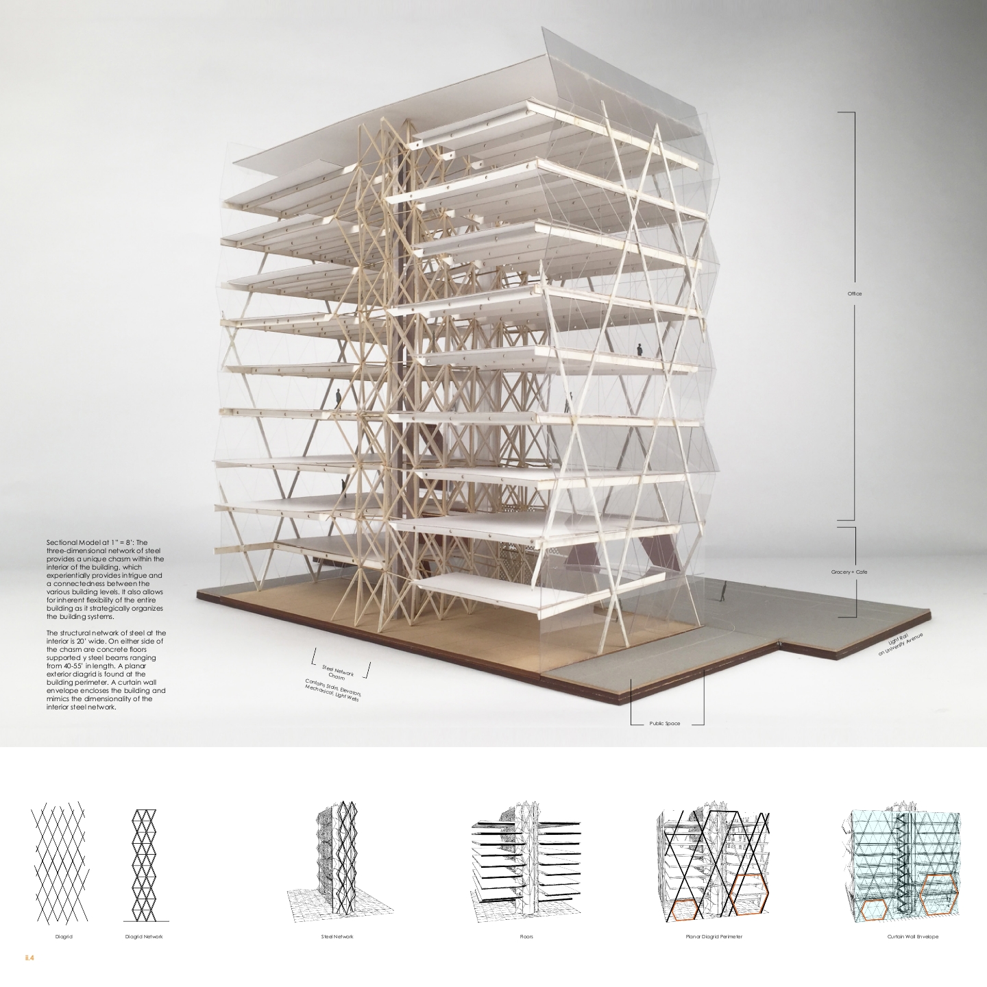
‘Innovation Initiation’ creates an identity of innovation for the self-titled Raymond Creative Enterprise Zone in the Saint Anthony Park neighborhood. A vision exists for the community to be entrepreneurial and exude creativity, freeing itself from its industrial reputation. ‘Innovation Initiation’ takes a first look at how innovation can be integrated through building.
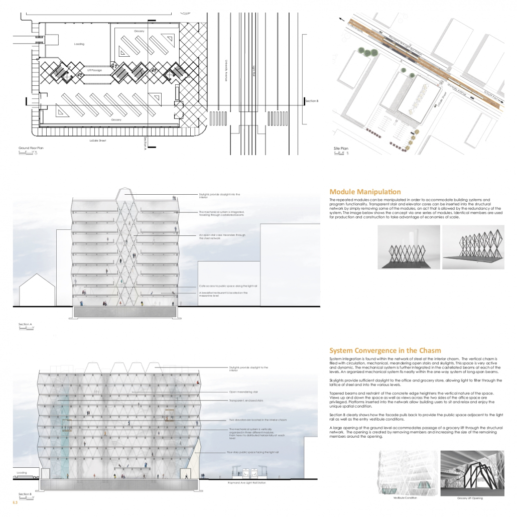
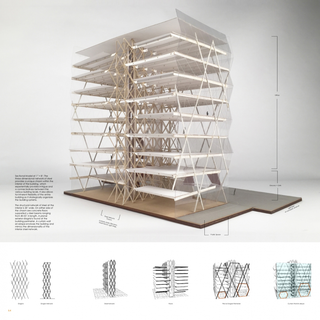
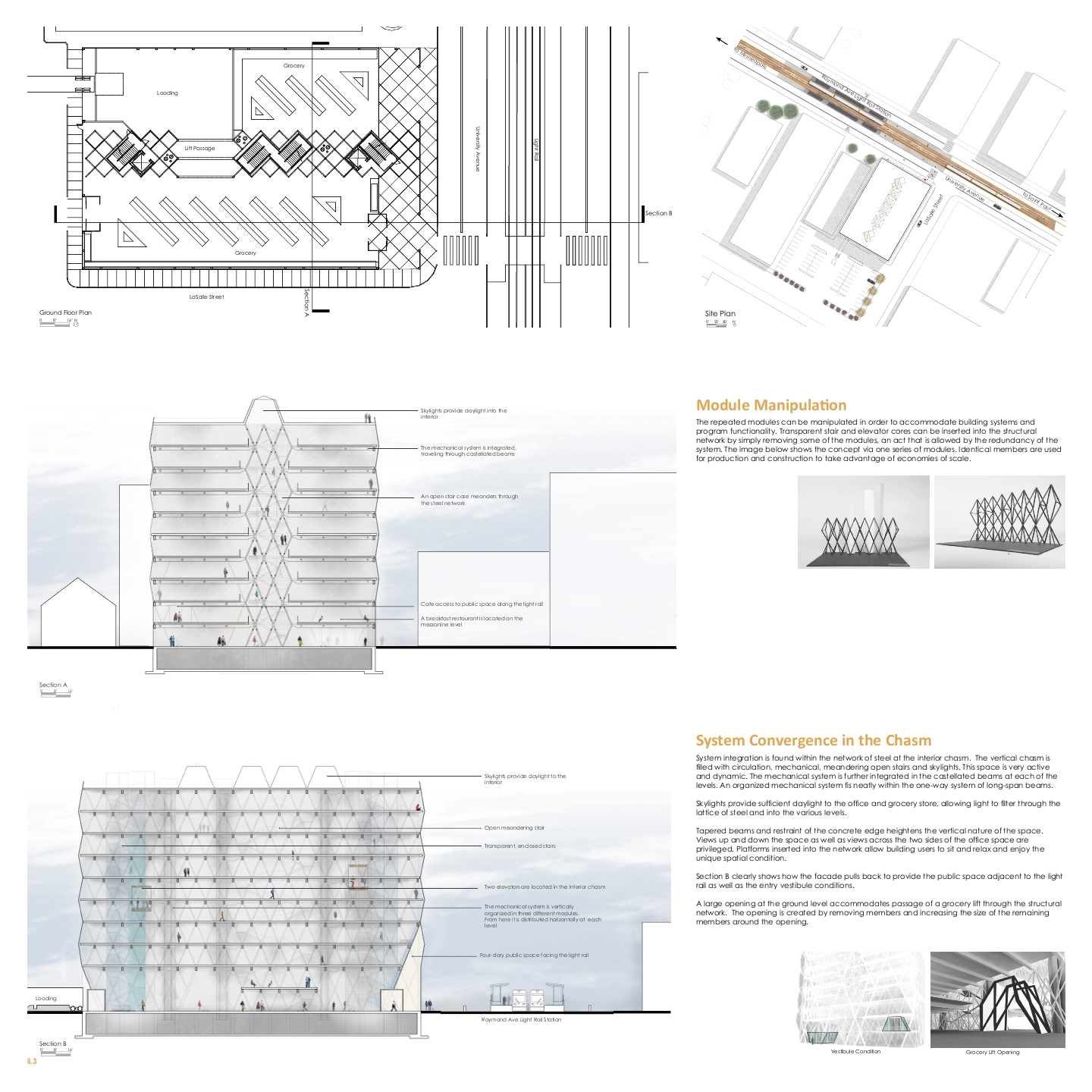
Innovation is expressed structurally as well as programmatically. Down the building center, a network of steel creates a 20’ wide, 120’ tall vertical chasm where people, light, and building systems converge. This expanded diagrid uses 6-inch pipes to form a 10’x10’x12’ pyramidal module that repeats in plan and elevation. The redundancy gives the impression of a delicate, crystalline network of steel. Structurally, the expanded diagrid takes on the gravity and lateral loads, freeing the fire stairs and elevators from their concrete shaft. Therefore, transparency of the circulation enclosure is allowed heightening the dynamism of the interior chasm. Open meandering stairs and landings where people can rest are located within this great vertical space. Light filters in through various skylights, scattering off of the slender pipes, providing daylight to the interior. On either side of this vertical chasm are open floor plates ranging from 40-55’ in width, providing adequate open space for the office and grocery store. Tapered beams at the edge of the chasm heighten the vertical experience. At the perimeter, a conventional diagrid structure is used, and an undulating glass façade mimics the dimensionality of the interior steel network.
The mechanical and electrical systems are organized within the modules and dispersed through castellated beams. The integrated approach lends the building to be inherently flexible, providing a blank canvas for companies to adapt the space as needed. Companies promote their image on the glass façade, reinforcing the new image of innovation to one million monthly light rail passersby.
Category I: TALL BUILDINGS
HM – IM//PORT L.A. Tri-Commerce Epicenter for Los Angeles
Students: Michael Chin & Alexander Kim, Woodbury University
Faculty Sponsor: Gerard Smulevich, Woodbury University



Project Description
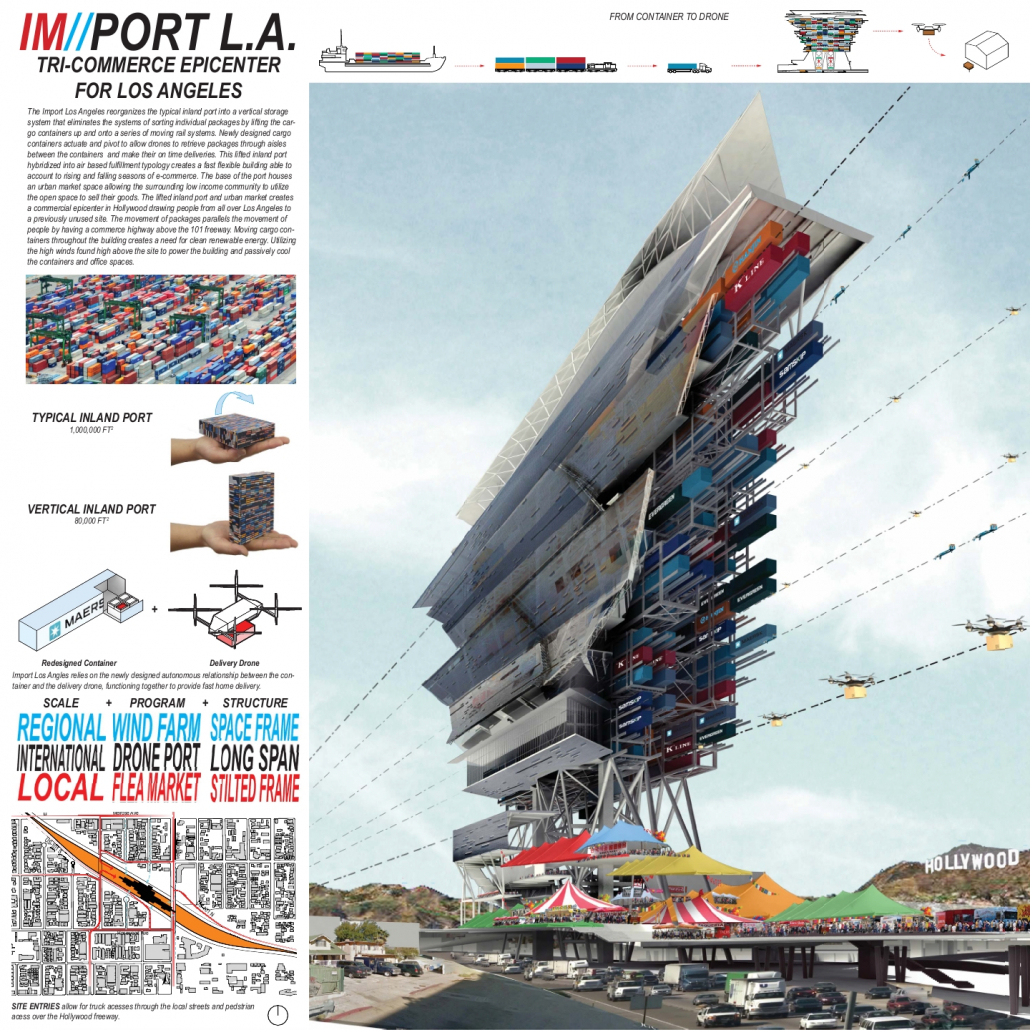
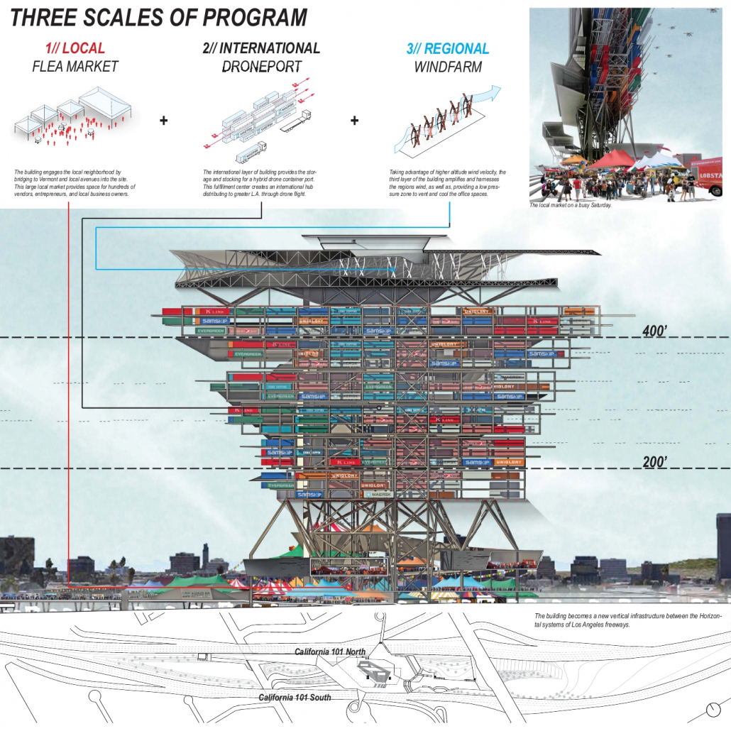
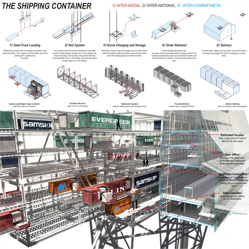
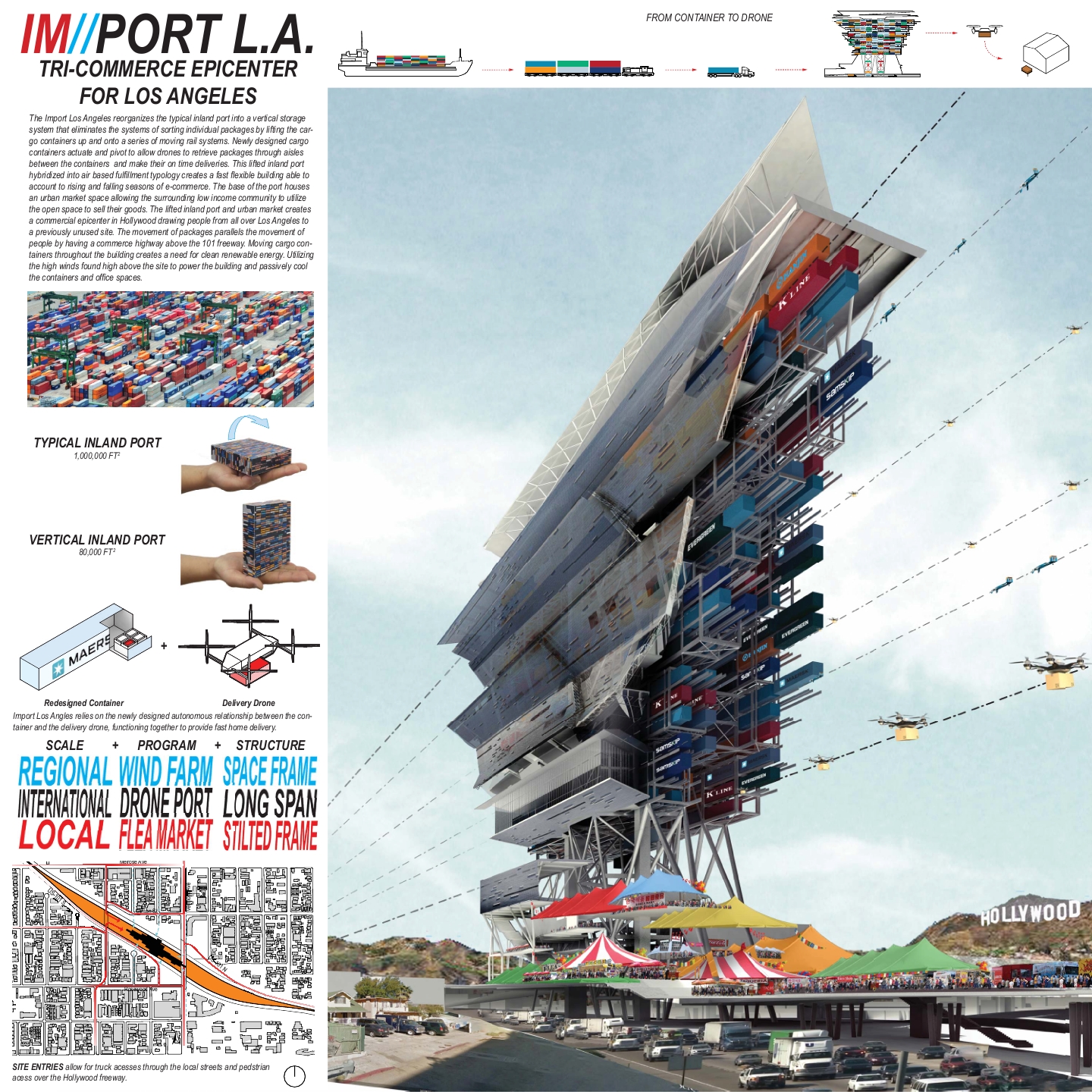
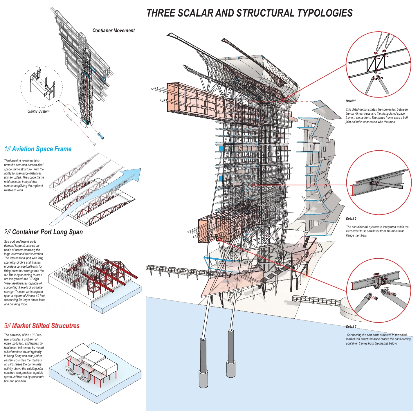
The Port of Los Angeles is one of the busiest international ports in the United States. The freeways are the main connection from the port to stores all throughout Los Angeles. The site is wedged between the 101 freeways utilizing this important connection. However the shift from traditional store fronts to online markets has created a demand for a large infrastructural architecture that supports the storage and dispersal of these e-commerce goods. With the prospects of instant delivery utilizing drone technology the Federal Aviation Administration has deemed that this drone corridor will take place between 200 to 400 feet. Aggregating prepacked redesigned cargo containers within this drone corridor allows the drones to pick up packages directly from the source without flying below 200 feet cutting out all of the systems between receiving the cargo and shipping the packages. The international language associated with the container can be read through the building as the amount of containers placed within becomes a representation of the rise and fall of the global economy. Underneath the lifted port sits massive open spaces raised above the noise and pollution of the 101 freeway. This market bridges over the freeway into the local neighborhood connecting the local inhabitants to a centralized marketplace in Hollywood. The open space allows a colorful mix of vendors, local farmers, and small businesses to begin a dialogue between the thriving local market and the bustling international e-commerce above. Sheltering the lifted port from above is the wind farm. Utilizing the regions wind currents and amplifying them to generate power for the building and the city. This area above the drone air space also houses the drone flight control and over watch center. IM//PORT L.A. becomes the commercial epicenter of Los Angeles by delivering international trade directly to the city’s inhabitants.
Category II: OPEN
HM – Creature
Student: Xiaoyin Xie, California Polytechnic State University
Faculty Sponsor: Thomas Fowler, California Polytechnic State University



Project Description
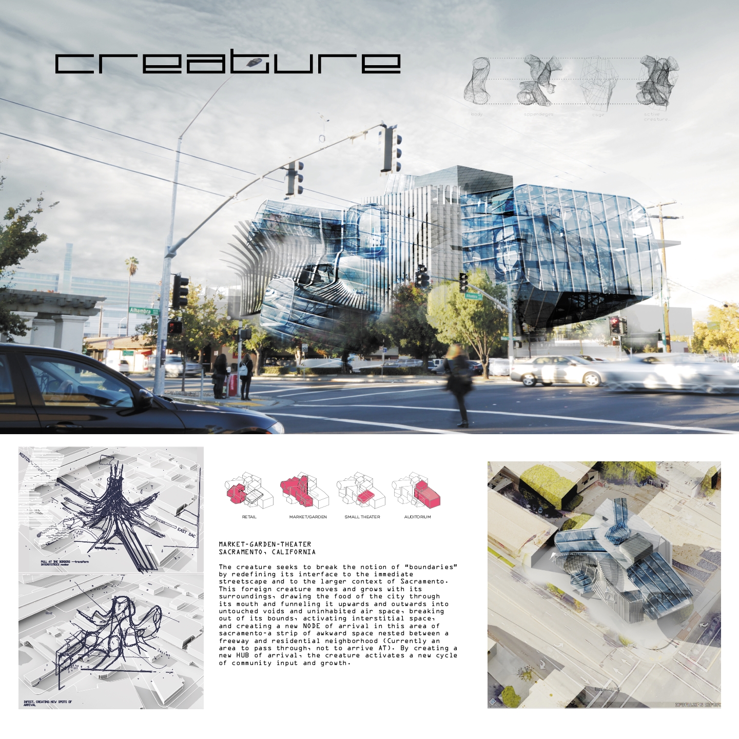
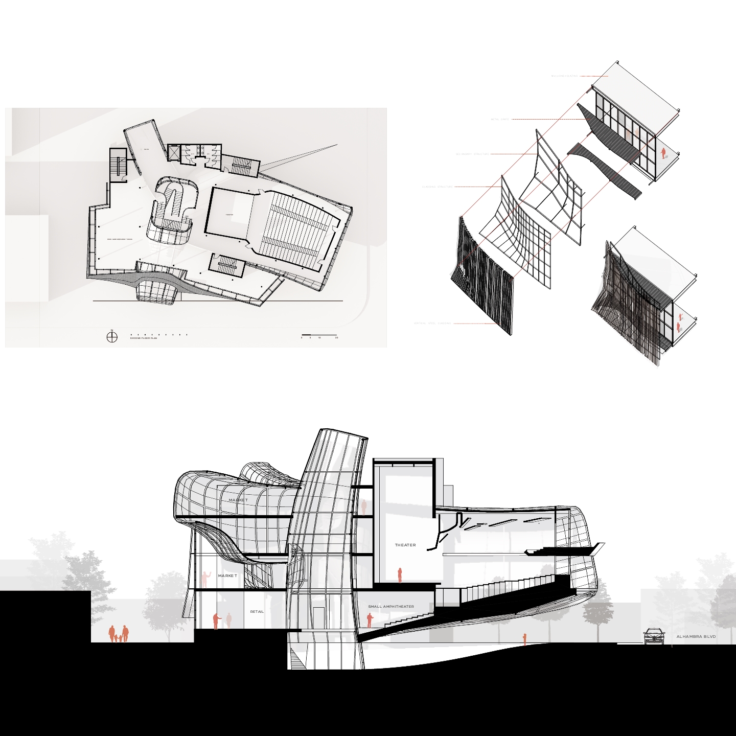
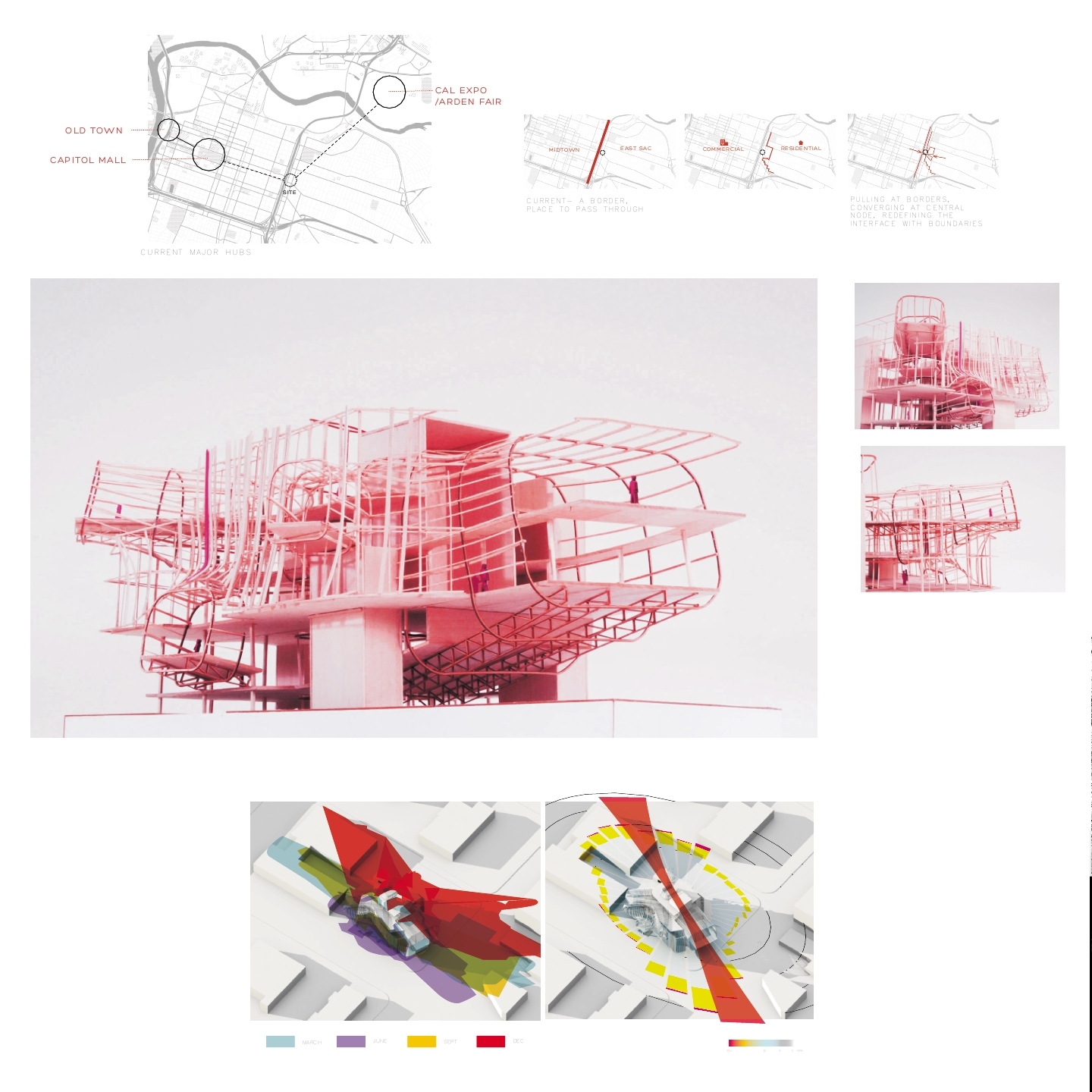
THE CREATURE seeks to break the notion of “boundaries” by redefining its interface to the immediate streetscape and to the larger context of Sacramento. This foreign creature moves and grows with its surroundings, drawing the food of the city through its mouth and funneling it upwards and outwards into untouched voids and uninhabited air space. Nestled in a border zone between a freeway and residential neighborhood, it seeks to create a new NODE of arrival in this area of Sacramento. By transforming an interstitial zone of passage into a HUB of arrival, the creature activates a new cycle of community input and growth.
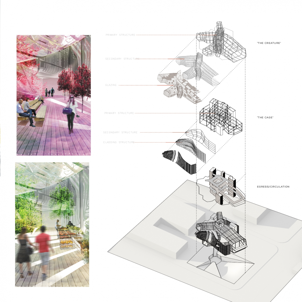
Stage 1: HOST. The cage, defined by the site and its boundaries, imposes regularity (a gridded steel structure with typically regularized parts—service cores, theater box, vertical circulation towers). Stage 2: INFECT. The creature infects the dormant cage, seeking to break it apart and directly interface with the outside. It latches onto the ground and creates depressions that funnel toward its feeding mouth. A steel structural skeleton with a secondary mullion structure is clad with glass, forming the creature that penetrates past the cage. Stage 3: GROW. The creature has punctured through the cage, so that the two are intertwined, supporting the other. The large auditorium appendage cantilevers with an extensive steel structure that transfers loads back to the center spoke of the creature. These appendages act as “teasers;” they protrude in specific directions—to the back street, towards Capitol Blvd, to the street intersection—but are not entrances into the building. Visitors are disoriented as they enter through mysterious ground depressions, but are reoriented once they converge at the central belly. Thus the creature becomes an ORIENTOR and a CONNECTOR—it tugs at its borders and funnels city forces, orienting them toward this living hub and then creating new, richer connections in the community.
Category II: OPEN
HM – Unearth Archaeology Research Center
Students: Trent Harrison & Andrew Lopez, Louisiana Tech University
Faculty Sponsor: Kevin J. Singh, Louisiana Tech University
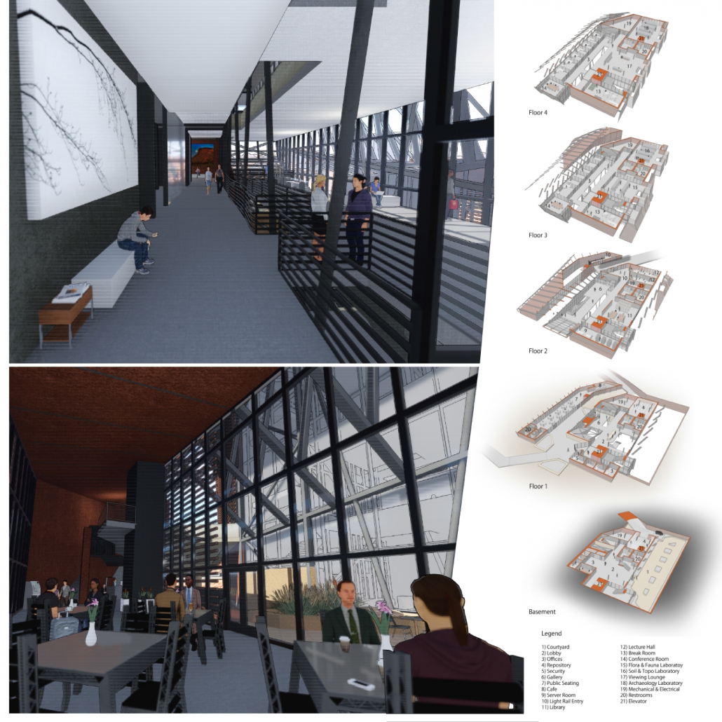


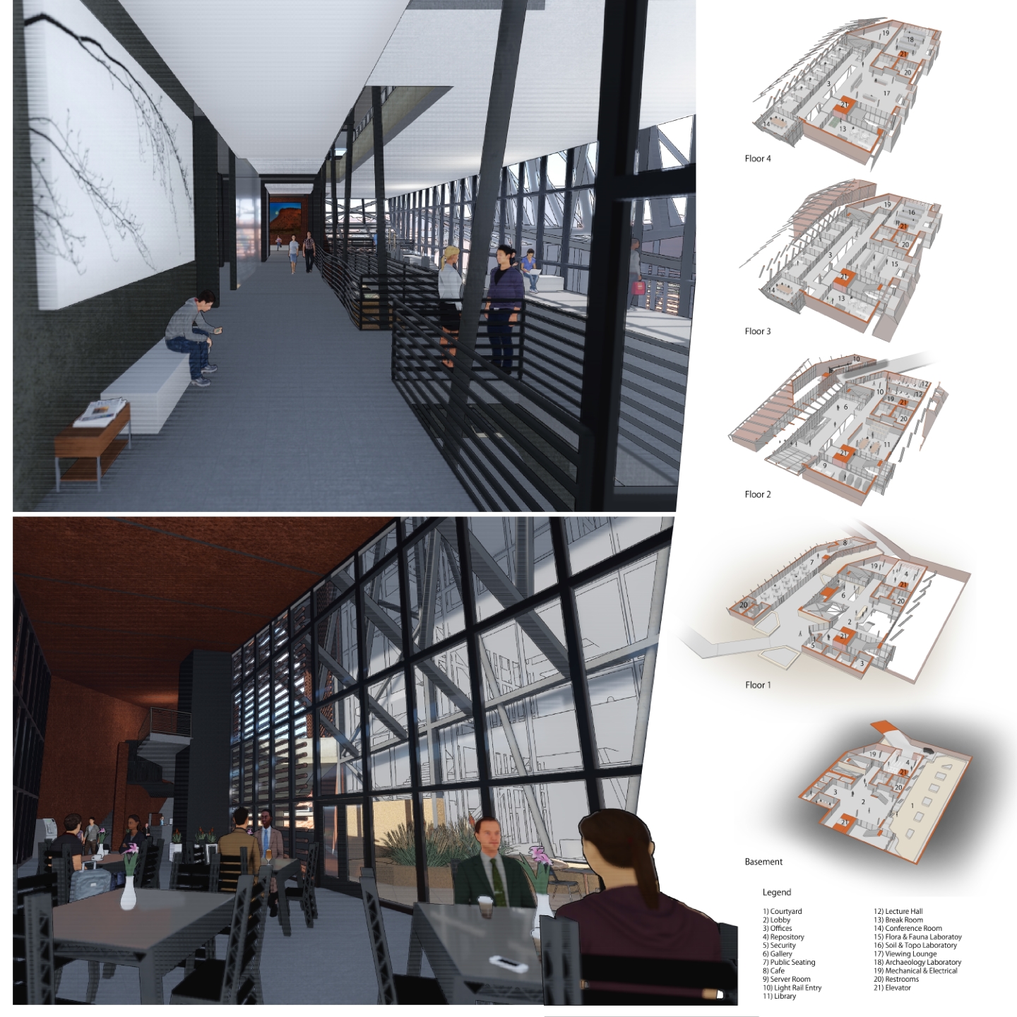

Project Description
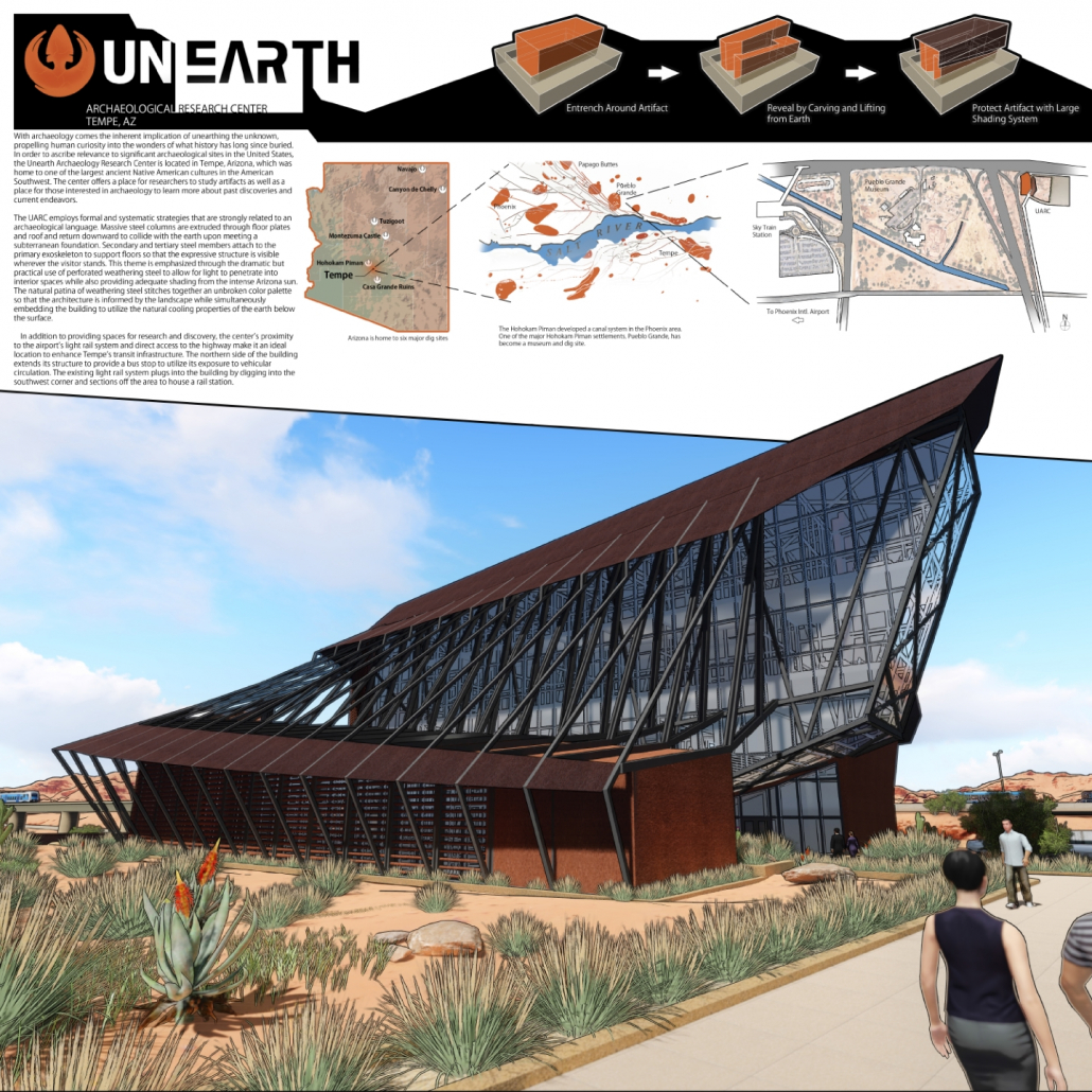
With archaeology comes the inherent implication of unearthing the unknown, propelling human curiosity into the wonders of what history has long since buried. In order to ascribe relevance to significant archaeological sites in the United States, the Unearth Archaeology Research Center is located in Tempe, Arizona, which was home to one of the largest ancient Native American cultures in the American Southwest. The center offers a place for researchers to study artifacts as well as a place for those interested in archaeology to learn more about past discoveries and current endeavors.
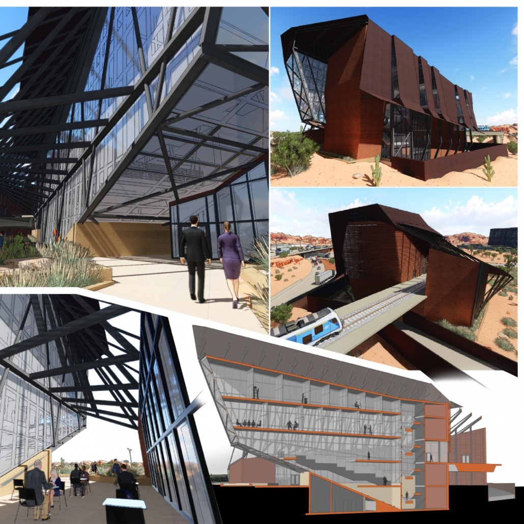
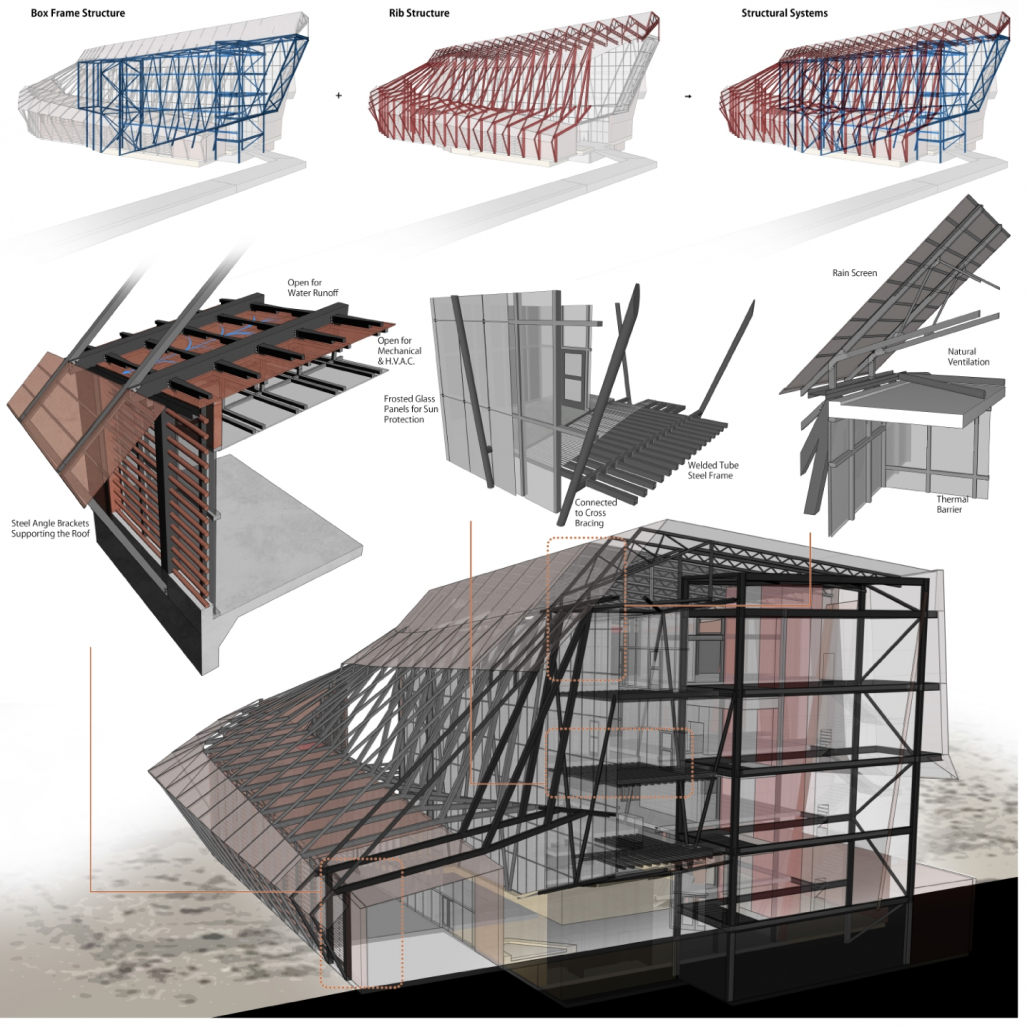
The UARC employs formal and systematic strategies that are strongly related to an archaeological language. Massive steel columns are extruded through floor plates and roof and return downward to collide with the earth upon meeting a subterranean foundation. Secondary and tertiary steel members attach to the primary exoskeleton to support floors so that the expressive structure is visible wherever the visitor stands. This theme is emphasized through the dramatic but practical use of perforated weathering steel to allow for light to penetrate into interior spaces while also providing adequate shading from the intense Arizona sun. The natural patina of weathering steel stitches together an unbroken color palette so that the architecture is informed by the landscape while simultaneously embedding the building to utilize the natural cooling properties of the earth below the surface.
In addition to providing spaces for research and discovery, the center’s proximity to the airport’s light rail system and direct access to the highway make it an ideal location to enhance Tempe’s transit infrastructure. The northern side of the building extends its structure to provide a bus stop to utilize its exposure to vehicular circulation. The existing light rail system plugs into the building by digging into the southwest corner and sections off the area to house a rail station.
ACSA Competitions
competitions@acsa-arch.org
202-785-2324

 Study Architecture
  ProPEL